
Easily Make a Glass Texture Effect in Photoshop
Tutorialsby Diego Sanchez
The glass effect has been used by many designers and photographers to add depth and dimension to their compositions with a touch of modern elegance. There are, of course, many different ways to apply a glass effect in Photoshop, but today I will show you how easy it is to make your own glass texture...
Read more
How to Easily Make Your Vector Digital Signature
Tutorialsby Diego Sanchez
In today's digital life, whether you are a freelancer, a business owner, or simply someone who frequently engages in digital transactions, having a well-crafted digital signature is almost indispensable to add a touch of authenticity and credibility to your documents. So today, I will show you how e...
Read more
Easily Make an Editable Grunge Text Effect in Photoshop
Tutorialsby Diego Sanchez
There are different ways to make a grunge text effect in Photoshop while keeping your text fully editable, and the most known one is to use a texture as a layer mask to hide part of the text. But Today I will show you a differnt approach on how you can make this kind of effect, while keeping you tex...
Read more
How to Add Blur and Bokeh Effects in Lightroom
Tutorialsby Diego Sanchez
Sometimes, we need to edit certain photos to give them a much more pronounced character, and one of the techniques at our disposal is to create a deeper depth of field to highlight our subject. To do this, we have several options: one of them is to manually edit the photo in our preferred applicatio...
Read more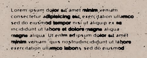
How to Make a Ink Bleed Paragraph Text Effect in Photoshop
Tutorialsby Diego Sanchez
If you are working on a vintage or grungy inspired poster, or even if you are just looking to give some retro style to your projects, applying some effect to your text is a necessary step you must take. You probably saw many different text effects used on a variety of designs, but often those effect...
Read more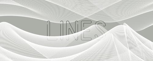
How to Easily Make a Line Mesh in Photoshop
Tutorialsby Diego Sanchez
With wire meshes being used on many designs, you may wonder how these complex and beautiful graphics are made. You might think they take time and a lot of work (some do), but there are many different methods to create these meshes. And some of them can be made in less than 10 minutes! So today, I wi...
Read more
How to Quickly Make a Blurred Halftone Effect in Photoshop
Tutorialsby Diego Sanchez
Halftone is a printing technique that mimics continuous-tone visuals by employing dots that change either in dimension or spacing, producing a gradient-like impression. It has been used in design and illustration for decades, frequently featured in various design pieces to create captivating backgro...
Read more
How to Easily Clone in Perspective in Photoshop
Tutorialsby Diego Sanchez
When you need to clone elements or extend backgrounds in an image, there are various techniques you can use in Photoshop to accomplish the task. But when you need to clone elements in perspective, it can be quite challenging task as it requires careful attention to maintain proper proportions and al...
Read more
How to Easily Make Custom Shadows Overlays in Photoshop
Tutorialsby Diego Sanchez
Shadows are a bit more than a dark patch on a canvas, they effortlessly transform flat images giving them depth, adding drama and an irresistible mood. But sometimes, the image you want to use does not have that specific shadow you want (an object, a window, a tree, a plant, etc) and you may discard...
Read more
How To Easily Make a Halftone Effect in Photoshop
Tutorialsby Diego Sanchez
Known for the ability to transform images into captivating patterns of dots, halftones have stood the test of time as a beloved artistic technique. And in Photoshop, there are many different methods to achieve this effect. Some are a bit more time consuming than others, but with the latest updates i...
Read more
How to Make a Hollow Spining Text Effect in Illustrator
Tutorialsby Diego Sanchez
Sometimes, when you need to create captivating text effects, your may instinctively turn to Photoshop as the go-to tool. However, an equally powerful and versatile option as Illustrator maybe what you need. With Illustrator's incredible capabilities you can craft incredibly text effects, including a...
Read more
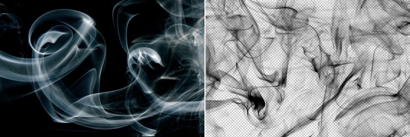
How to Keep Original Shadows While Removing the Background in Photoshop
Tutorialsby Diego Sanchez
One of the most common challenges when removing the background of an image is maintaining the natural shadows that make it look more realistic. Fortunately, Photoshop is a powerful tool that can help you remove backgrounds from your images. But it can also be tricky to keep the original shadows inta...
Read moreGet the newest resources
Sign up for our mailing list and get new resources sent to your inbox