
The Blank Slate: Designer or Illustrator?
Articlesby Nathan Brown
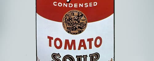
I once heard someone describe the difference between a "Designer" and an "Illustrator" as follows... A designer assembles pre-exisiting elements such as photos, vectors, and textures to create a final piece. Whereas an Illustrator creates a piece by hand, creating element from scratch using his/her ...
Read more
Wallpaper of The Week #16 by Matt M. Laskowski
Inspirationby Nathan Brown
Wallpaper of the week #16 is by an incredible illustrator from Boston, Massachusetts named Matt M. Laskowski. Matt is a jack-of-all-trades between illustration, photography, and graphic design, but his true focus lies within Illustration. His illustration centers around conceptual art design, as he...
Read more
Community Art: A Showcase of the WeGraphics Design Community
Articlesby Nathan Brown
We've had a great turn out on the WeGraphics Flickr Community in its first week! It was hard choosing these top five pieces to feature. If you haven't been over there to check the art displayed by our readers, then you are missing out! There is truly some inspirational work. Below is just a taste. ...
Read more
Illustration Tutorial: Creating an iOS Device Connector in Photoshop
Tutorialsby Conor O'Driscoll
If you own any iOS devices, you'll be all too familiar with the dock connector. It sits there, on your desk, only letting Apple products use it. But have you ever stopped and looked at its beauty? Despite being a simply cable, Apple has added some nice curves and a design which makes it ideal for a ...
Read more
The Blank Slate: Designing for a Niche Market
Articlesby Nathan Brown
The thing I love most about being a designer is not knowing what your next job might be. I've worked on a project for a fishing lodge in Alaska and labels for Lego toys both at the same time. Being a designer can be an extremely versatile job. Who could get bored with such a variety of work?Over the...
Read more
Creating an Expressive Painting Using a Freestyle Method in Photoshop
Tutorialsby Nathan Brown
In this tutorial I will share my process for what I call Freestyle Expressive Painting in Photoshop. My goal is not too teach any new mind blowing techniques here, but to explore my process for creating a piece of art through a rough idea or loose concept. The process is very open, and involves a bi...
Read more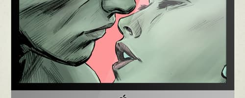
Wallpaper of The Week #15 by Mitch Breitweiser
Inspirationby Nathan Brown
This week we have an incredible wallpaper from comic artist Mitch Breitweiser. The artwork a panel from Marvel's Sub-Mariner 70th Anniversary comic. To view more of Mitch's amazing work visit his website at mitchbreitweiser.com or follow him on deviantART. You can also find his work on the shelves o...
Read more
Join The NEW WeGraphics Flickr Group!
Newsby Nathan Brown
This month we will begin to feature artwork from our community. The weekly feature will display some of the best work shared through our brand new Flickr Group. Head over to Flickr now to become a member. We encourage you to post work that contains at least one resource obtained from WeGraphics. We ...
Read more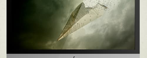
Wallpaper of The Week #14 by Dennis Sibeijn
Inspirationby Nathan Brown
Our wallpaper of the week this week features an incredible talent from The Netherlands. The designer's name is Dennis Sibeijn. This piece is titled "Truth". To see more amazing artwork from Dennis, visit his website at damnengine.net. Get unlimited access to 3000+ design resources for only $...
Read more
The best design resources of the month, April 2011 on WeGraphics
Newsby Team WeGraphics
Our mission is simple and clear: we just want to serve your creativity! Over the last 4 weeks we released top-quality brushes, vectors, textures, patterns and templates and updated our blog with great tutorials, inspiration articles and advices to learn how to use our resources. WeGraphics is a ...
Read more
Bookmarked! Best readings of the week #27
Articlesby Team WeGraphics
Every week the design community releases a lot of interesting articles, tutorials and showcases that can charge your creativity in different ways. With this series we want to share high-quality contents from the community to provide interesting information for our readers. It's just a small selectio...
Read more
Create a Surreal Landscape Using Photo Manipulation
Tutorialsby patrick Monkel
In this tutorial I will give you some tips on how to make a surreal photo manipulation. The most challenging of doing manipulation is usually finding the right balance between your imported elements. Also the color of your elements and dynamic lightning are important things to make the scene more ?...
Read moreGet the newest resources
Sign up for our mailing list and get new resources sent to your inbox