
Web Tutorial: Designing and Coding a Clean Multi Purpose Website
Preview:
Here's what we're going to be creating: See live demo
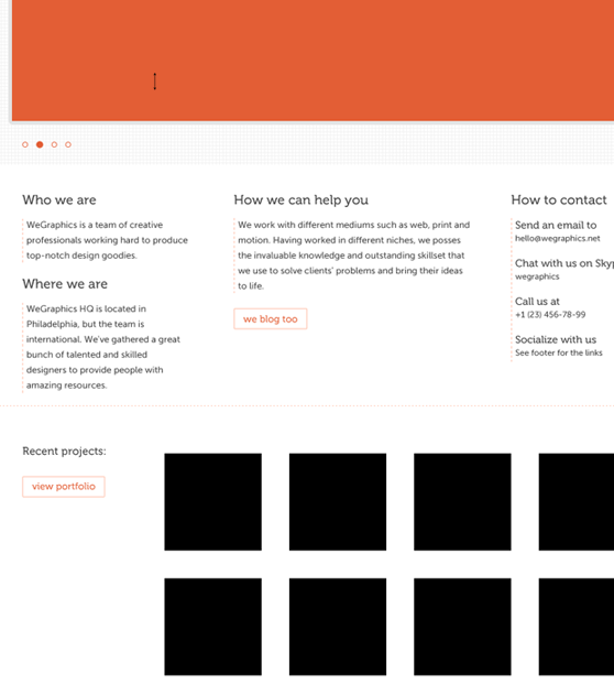
Wireframe
I had a clear image in my head of what I wanted this website to look like, so instead of sketching I went straight into Photoshop and put together this simple wireframe:
Photoshop
Step 0 - Preparations
I used the 960.gs 12-column grid template for this design. If you're working in Photoshop and didn't try it before, I'd suggest you get the 960gs Photoshop actions. With these actions you can create a new file of any desired dimensions and then it will take care of the guides and the grid overlay. Now you might say that it's not that hard to open up the psd template and change the canvas size, and I'd agree with you. But I like the action method better simply because you don't have to store the PSDs and look for them every time you start a new design. If you have already downloaded the 960.gs template pack, you'll find the Photoshop action in it. If you haven't, then go ahead and download it from its creator's website: 960-grid-actions Once the actions are loaded into Photoshop, you'll need to work on them a little, because by default the action dialogs are not working as you'd want them to. Let's find the action (12 column grid in this case) on the action panel and look at its dialogs state. If it is on, toggle it off by clicking on this little icon: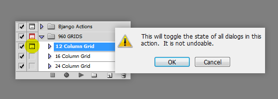 Then go ahead and twirl down the action menu and click on its dialog toggle switch to turn it on. This is the only dialog that we need to pop up when we play the action. It will let us specify the document's size.
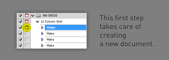 Play the said action and it should prompt you with a new document window. Set it to 1020x1420px (our content will be contained within 940px) and hit OK, the guides should be created in a second.
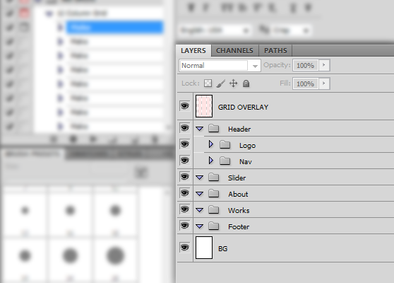
Also make sure you start organizing your PSD from the get-go.
Play the said action and it should prompt you with a new document window. Set it to 1020x1420px (our content will be contained within 940px) and hit OK, the guides should be created in a second.
Also make sure you start organizing your PSD from the get-go.
Step 1 - The Logo
Drag out the horizontal guide at 50px and below it type out the wordmark. I used Apricot set at 46pt and in #e35e35. Drag another guide below the logo, for the sake of easy slicing later on. It this case the guide is placed at 109px.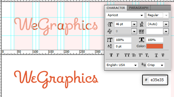
Step 2 - Navigation Menu
Let's move on the navigation. It will be floated to the right, so align it accordingly.The font I used for the navigation was Museo500, 14pt, #454545. The distance between each word is 34px. In case you don't have it or haven't heard of it (which is unlikely), you can get it from here. Museo family is not entirely free, but some of the weights are. Grab the 500 one. At this point we don't need to design the hover and active states for this menu. As you can tell from the preview, it will only be a matter of a few lines of CSS.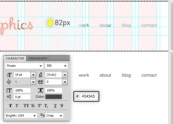
Step 3 - Slider Section
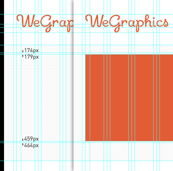
Make a new horizontal guide 40px below the last one - at 149px, and another one 373px further down - at 522px. This will be the slider section. Fill it using 'clean pattern 3 light' from this Minimal Patterns for Backgrounds set.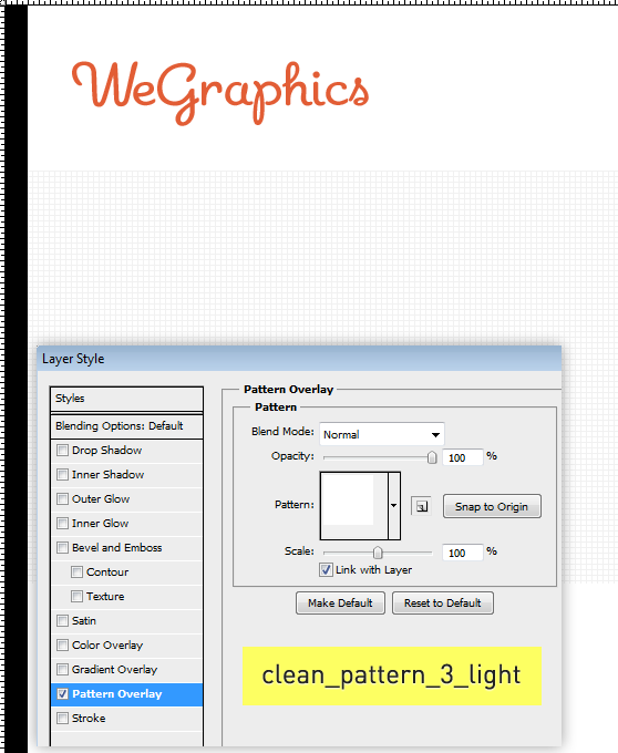 Drag another horizontal guide 30px down from the top of the slider section, that would be 179px.
The slider window's height is 280px, that's another guide, at 459px. The width is 940px. Call this layer as 'window' and fill it with any color for now.
Drag another horizontal guide 30px down from the top of the slider section, that would be 179px.
The slider window's height is 280px, that's another guide, at 459px. The width is 940px. Call this layer as 'window' and fill it with any color for now.
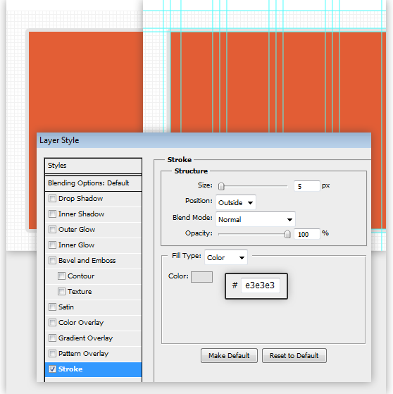
 To finish off the slider window, go to the layer's blending options and apply a 5px, light-grey stroke to it.
Step 4 - Slider Controls
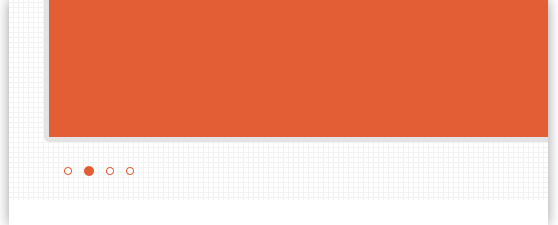
In this example I used 4 images for the slider, hence 4 bullets. Drag out 2 new horizontal guide at 489px and 497px, and a vertical one at 55px. Using the Ellipse Tool (U) draw four identical circles between the two horizontal guides you just created. Apply to three of them a 1px inside stroke using #e35e35 for the color, using white as its fill or reducing it all the way down to to 0%. The active state bullet's diameter is 10px (instead of 8px for normal state). To make it, either re-draw the circle or just change the fill color to #e35e35 and switch the stroke to be outside. Align the bullets as shown here: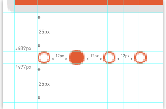 This how it should look like at this point:
Step 5 - About Us Section - 1st column
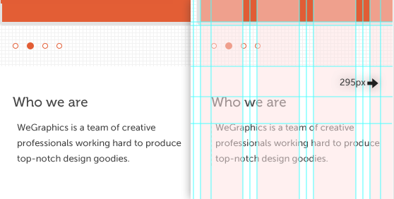
Make a new horizontal guide at 565px (about 40px below the slider section) and type out the first heading, 'Who we are', in Museo500, 19pt, #454545. The paragraph text is 25px below the heading, has a 5px padding on the left, and is set in Museo Sans 500, 13pt. Again, the font can be downloaded from here.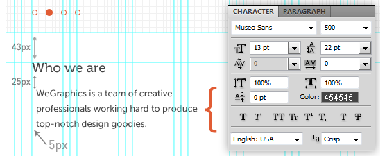 Make sure the width of this paragraph does not exceed 240px, a new vertical guide at 295px will help you control this.
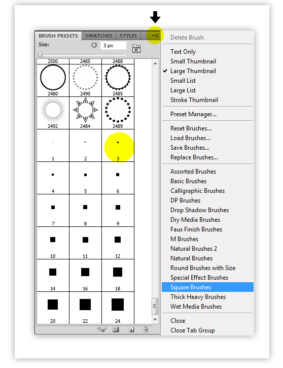
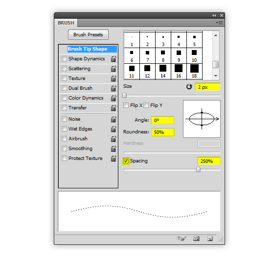
 Now onto the border next to the paragraph. First of all, load the square brushes using the Brush Presets panel and select the 3px one.
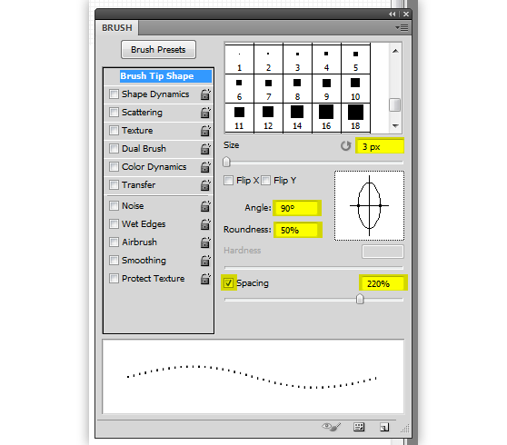
 Use the following settings to make the brush draw vertical(!) dashed lines:
 Holding Shift, draw the border like this:
 Duplicate this whole little section (you still keep everything organized and it's all in one dedicated folder, right?) and move it down 35px.
Step 6 - 2nd column
Create a new column the same way as the first one, keeping the paragraph width from going over 345px. A vertical guide at 705px will do the trick. Below the text paragraph create a button of a size of 104x28 px, set the fill to white, add a 1px #ffbca4 stroke and center-align the text inside it. The font for it is Museo500 at 14pt, #e35e35.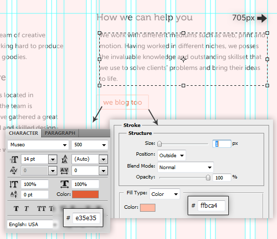 Clean view:
Step 7 - 3rd column
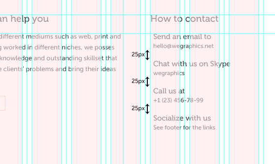
Last, 3rd column's width is 205px. These are the font settings: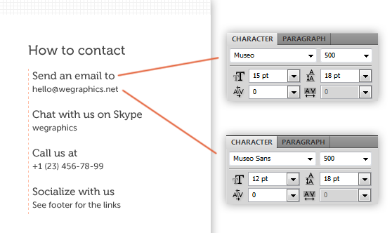 The distance between these little paragraphs is 25px.
Step 8 - Divider (<hr />)
Make a new horizontal line at 868px. Get back to the square brushes and pick the 2px one. Use the following settings...
 ...and draw the divider like so (the color is #ffbca4):
Step 9 - Recent Projects Section
Make a new guide at 932px and type out the section heading. Font settings are: Museo500 16pt, #454545. Copy the button from the previous section, adjust its size (118x28px in this case) and put it 30px below the 'recent projects' heading.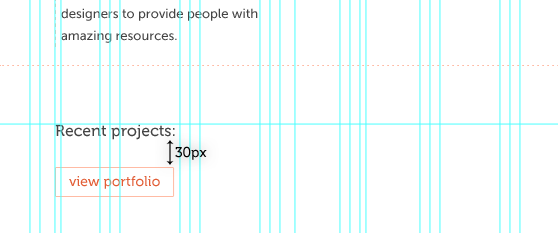
Step 10 - Project Thumbnails
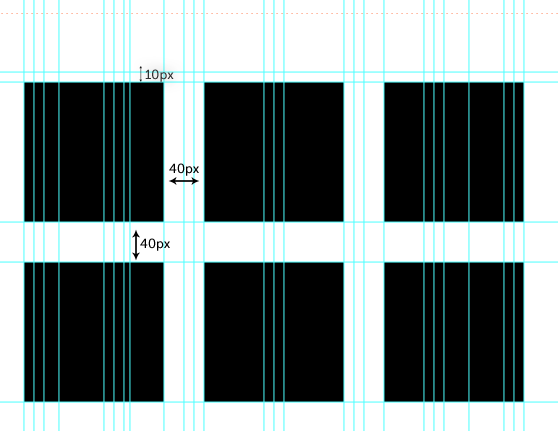
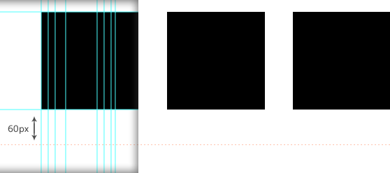
Using the Rectangular Marquee Tool (M) create one 140x140px thumbnail. Duplicate it and move 40px to the right. Repeat 2 more times.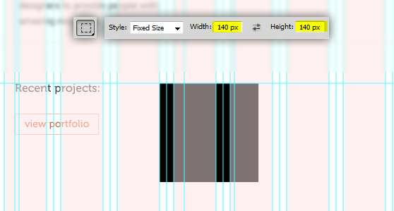 Move the whole group down 10px. Duplicate it, to make the second row, and move it down 40px below the first row.
 And this is how it all looks at this point:
 Duplicate the <hr /> divider and place it 60px below the 'recent projects' section.
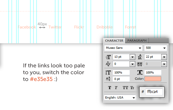
 And the final step of the design part is to add links to the footer, 45px below the last divider. These are the settings for type, color and spacing:
Slicing
Slice out the logo, the bullets (as a sprite, on a transparent background!) and the project thumbnail. The project thumbnail is a sprite too. We'll make it go from grayscale to full-color on hover.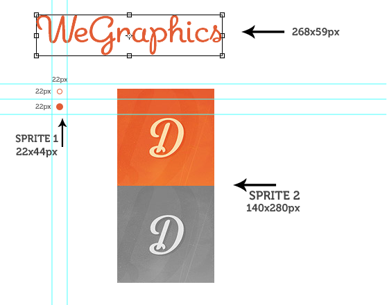 As for the slider section background, where we used a pattern, go back to that layer's blending options and hover over the pattern to see its title. In this case, 'clean pattern 3 light' says it's 5x5px, which means it will be enough to slice out a 5 by 5 piece to make the background seamless.
Markup
Step 0 - Preparations
I know it should go without saying, but don't forget to create separate folders for the images, stylesheets and scripts.Step 1 - Basic Document Structure
We're using HTML5 and declaring HTML5 DOCTYPE is as easy as . IE doesn't not support the new HTML5 elements so we need to call the 'html5shiv' script from the of the document.<!--[if IE]> <mce:script _mce_src="http://html5shiv.googlecode.com/svn/trunk/html5.js"></mce:script> <![endif]-->
Step 2 - The Logo
For the logo we're using the h1 tag, but in this case we don't have a webfont we need, so we'll replace it with the image later in the CSS part.<h1><a title="WeGraphics - high quality design resources and tutorials" href="https://wegraphics.net">WeGraphics</a></h1>
Step 3 - Navigation Menu
In the preview you saw the dropdown in the nav menu, which is exactly what this code is creating. We're using an unordered list for our navigation and the dropdown is simply another unordered list inside one of the main list items. The first link has a class of 'active' so we could style the active state of the navigation.<ul> <li><a class="active" href="#">home</a></li> <li><a href="#">work</a> <ul class="dropdown"> <li><a href="#">web</a></li> <li><a href="#">print</a></li> <li><a href="#">illustration</a></li> <li><a href="#">motion</a></li> </ul> </li> <li><a href="#">about</a></li> <li><a href="#">blog</a></li> <li><a href="#">contact</a></li> </ul>
Step 4 - Slider
Let's save a room for the slider but keep it empty for now. We'll get back to it at the end of the tutorial and I'll explain why...<hr />
Step 5 - About Us Section
We've got 3 columns, each of which is a
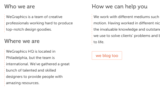
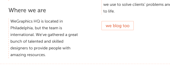
<div class="column">
<h2>Who we are</h2>
WeGraphics is a team of creative professionals working hard to             produce top-notch design goodies.

<h2>Where we are</h2>
WeGraphics HQ is located in Philadelphia, but the team is             international. We've gathered a great bunch of talented and skilled             designers to provide people with amazing resources.
</div>

<div class="column pitch">
<h2>How we can help you</h2>
We work with different mediums such as web, print and motion.         Having worked in different niches, we posses the invaluable             knowledge and outstanding skillset that we use to solve             clients' problems and bring their ideas to life.
<a href="#">we blog too</a> <!-- this will be a button -->
</div>

 <!-- We'll style the third column's paragraphs and links a bit         differently from the rest. The telephone number needs to be wrapped into         a <span> tag in order for the whole column to be styled with         consistency-->

<div class="column contacts">
<h2>How to contact</h2>
Send an email to <a href="mailto:#">[email protected]</a>
Chat with us on Skype <a href="callto:#">wegraphics</a>
Call us at <span>+1 (23) 456-78-99</span>
Socialize with us <a href="#footer">See footer for the links</a>
</div>

<hr />
Step 6 - Latest Projects Section
Everything here is self-explanatory:<h3>Recent projects:</h3> <a href="#">view portfolio</a> <ul> <li class="item1"><a href="#"></a></li> <li class="item2"><a href="#"></a></li> <li class="item3"><a href="#"></a></li> <li class="item4"><a href="#"></a></li> <li class="item5"><a href="#"></a></li> <li class="item6"><a href="#"></a></li> <li class="item7"><a href="#"></a></li> <li class="item8"><a href="#"></a></li> </ul> <hr />
Step 7 - Footer
<a href="#">Facebook</a> <a href="#">Twitter</a> <a href="#">Flickr</a> <a href="#">Dribbble</a> <a href="#">Forrst</a> All content ? 2011 WeGraphics & DesignerOnDuty. All rights reserved.
CSS
Step 1 - CSS Reset
CSS reset is a very important part of every project, always start with it. /*** CSS RESET ***/ html, body, div, span, object, iframe, h1, h2, h3, h4, h5, h6, p, blockquote, pre, abbr, address, cite, code, del, dfn, em, img, ins, kbd, q, samp, small, strong, sub, sup, var, b, i, dl, dt, dd, ol, ul, li, fieldset, form, label, legend, table, caption, tbody, tfoot, thead, tr, th, td, article, aside, canvas, details, figcaption, figure, footer, header, hgroup, menu, nav, section, summary, time, mark, audio, video{ margin:0; padding:0; border:0; outline:0; font-size:100%; vertical-align:baseline; background:transparent; } body{ line-height:1; } article,aside,details,figcaption,figure, footer,header,hgroup,menu,nav,section{ display:block; } nav ul{ list-style:none; } blockquote, q{ quotes:none; } blockquote:before, blockquote:after, q:before, q:after{ content:''; content:none; } a{ margin:0; padding:0; font-size:100%; vertical-align:baseline; background:transparent; text-decoration: none; } ins{ background-color:#ff9; color:#000; text-decoration:none; } mark{ background-color:#ff9; color:#000; font-style:italic; font-weight:bold; } del{ text-decoration: line-through; } abbr[title], dfn[title]{ border-bottom:1px dotted; cursor:help; } table{ border-collapse:collapse; border-spacing:0; } /****** This content separator is already styled to match the look we are after ******/ hr{ clear: both; display:block; height:1px; border:0; border-top: 1px dashed #ffbca4; /* Change this color and border style to suit your needs */ margin:2.5em 0 3em 0; padding:0; } input, select{ vertical-align:middle; }
PS: note that I've already changed the HR style beforehand so that it would match the style of the separator we designed in Photoshop.
Step 2 - @font-face Declaration
Different browsers require different formats of the font in order for it to work with @font-face. If you don't have Museo web kit, you can get one over at MyFonts (use the links from the beginning of this post). Also, there's a @font-face kit generator over at fontsquirrel.com You can learn more about @font-face in this great article/* @font-face DECLARATION */
@font-face{
font-family: 'Museo-500';
src: url('../webfonts/eot/museo500.eot');
src: url('../webfonts/woff/museo500.woff') format('woff'),
url('../webfonts/ttf/museo500.ttf') format('truetype'),
url('../webfonts/museo500.svg#Museo-500') format('svg');
}
@font-face{
font-family: 'MuseoSans-500';
src: url('../webfonts/eot/museosans500.eot');
src: url('../webfonts/woff/museosans500.woff') format('woff'),
url('../webfonts/ttf/museosans500.ttf') format('truetype'),
url('../webfonts/museosans500.svg#MuseoSans-500') format('svg');
}
Step 3 - General
Now that we have declared our custom fonts using the @font-face feature, let's specify it the body selector.html{
width: 100%; height: 100%;
}
body{
font-family: 'MuseoSans-500', Helvetica, Arial, sans-serif;
font-size: 14px;
color:#454545;
background:#fff;
}
header{
width: 940px;
margin: 50px auto 30px; /* this will center the header on the page (horizontally) and apply the top and bottom margins */
}
Step 4 - The Logo
Time to replace the text of our logo with the image.header h1 a{
background: url('../img/logo.png');
width: 268px; height: 59px;
float: left; display: block;
text-indent: -99999px;
}
Step 5 - Navigation
As you remember from the Photoshop part, we're using Museo-500 for the navigation text, and as I said, the hover and active states style is just a couple of lines of code.header nav{
float: right;
margin: 10px 0 0 0;
font-family: 'Museo-500', Helvetica, Arial, sans-serif;
}
header li{
float: left; display: inline;
position:relative; /* We'll need this for the dropdown to work properly */
}
header li a{
display: block;
color: #454545;
padding: 8px 16px; /* Spacing out the links */
}
header li a:hover, header li a.active{
color: #fff;
background: #e35e35;
}
Step 6 - Dropdown
This will hide the contents of the dropdown from the screen when it's not called by the user (it's parent element is not hovered over). There's also a CSS3 transition applied to the opacity of the dropdown, making for its nice fadeout..dropdown{
list-style: none;
position: absolute;
left: -9999px;
z-index: 10; /* So the dropdown stays on top of everything else */
opacity: 0;
-webkit-transition: opacity 0.35s linear;
-moz-transition: opacity 0.35s linear;
-o-transition: opacity 0.35s linear;
transition: opacity 0.35s linear;
}
This will even the size of all of the list items in the dropdown and prevent the text from wrapping to the next line, unless the
tag is used ;).
.dropdown li{
    padding: 0;
    margin: 0;
    float: none;
}
.dropdown a{
    white-space: nowrap;
    text-align: left;
    display: block;
    font-size: 13px;
}
This is the style for the dropdown's appearance and behavior when it's active:
header li:hover ul{
    left: 0;
    opacity: 1;
}
header li:hover ul a{
    color: #e35e35;
    background: #fff;
    -webkit-transition: all 0.15s linear;
    -moz-transition: all 0.15s linear;
    -o-transition: all 0.15s linear;
    transition: all 0.15s linear;
}
header li:hover ul a:hover{
    color: #fff;
    background: #e35e35;
}
PS: I've learned this great pure-CSS dropdown technique from Harry Roberts and used it as a base for this example.
Check out the original article here.
Step 7 - Slider*
*We'll get back to it later but for now let there be a background:#slider{
clear: both;
height: 340px;
background: url('../img/slider_bg.png') repeat;
padding: 25px 0 8px 0;
position: relative;
top: 40px;
}
Step 8 - About Us section
First column:#about{
width: 940px;
margin: 30px auto 0;
}
.column{
float: left; display: inline;
width: 240px;
margin: 0 40px 0 15px;
text-align: left;
}
2nd and 3rd columns:
.pitch{ width: 345px; margin: 0 40px 0 25px; } .contacts{ width: 205px; margin: 0 15px 30px 15px; }
Typography etc.
 #about h2{
    font: 19px 'Museo-500', Helvetica, Arial, sans-serif;
    margin-bottom: 14px;
}
.column p{
    font-size: 13px;
    line-height: 1.7;
    margin-bottom: 18px;
    padding: 0 5px;
    border-left: 1px dashed #ffbca4; /* That vertical dashed line we've drawn in photoshop */
}
.contacts a, span{
    font-size: 12px;
    display: block;
    color: #454545;
    -webkit-transition: 0.15s linear color;
}
.contacts a:hover{
    color: #e35e35; /* Everything but the telephone number will change the color when hovered over */
}
Button:
.pitch p{
    margin: 0 0 28px 0;
}
.pitch a{
    font: 14px 'Museo-500', Helvetica, Arial, sans-serif;
    text-align: left;
    color: #e35e35;
    padding: 6px 12px;
    background: #fff;
    border: 1px solid #ffbca4;
    -webkit-transition: all 0.15s linear;
    -moz-transition: all 0.15s linear;
    -o-transition: all 0.15s linear;
    transition: all 0.15s linear;
}
pitch a:hover{
    padding: 6px 18px;
}
.pitch a:active{
    color: #fff;
    background: #e35e35;
}
Step 9 - Recent Projects section
#recent_projects{
    overflow: hidden;
    width:940px;
    margin: 60px auto 0;
}
#recent_projects h3{
    font: 16px 'Museo-500', Helvetica, Arial, sans-serif;
    margin: 0 0 35px 15px;
}
Button again, let's just copy the button style from one of the sections above.
#recent_projects p a{
    font: 14px 'Museo-500', Helvetica, Arial, sans-serif;
    text-align: left;
    color: #e35e35;
    margin: 0 0 0 15px;
    padding: 6px 12px;
    background: #fff;
    border: 1px solid #ffbca4;
    -webkit-transition: all 0.15s linear;
    -moz-transition: all 0.15s linear;
    -o-transition: all 0.15s linear;
    transition: all 0.15s linear;
}
#recent_projects p a:hover{
    padding: 6px 18px;
}
#recent_projects p a:active{
    color: #fff;
    background: #e35e35;
}
Step 10 - Project thumbnails
#recent_projects li a{
    display: block;
    width: 140px;  height: 140px;
}

#recent_projects li{
    float: left;  display: inline;
    margin: 20px;
}
Using the border radius to fake the circle shape.
If you want the same for IE, take a look at CSS3 Pie.
#recent_projects li{
    float: left;  display: inline;
    margin: 20px;
    -webkit-border-radius: 80px;
    -moz-border-radius: 80px;
    border-radius: 80px;
}
CSS3 transitions to reveal the original square shape on hover:
#recent_projects li{
    float: left;  display: inline;
    margin: 20px;
    -webkit-border-radius: 80px;
    -moz-border-radius: 80px;
    border-radius: 80px;
    -webkit-transition: -webkit-border-radius 0.20s linear;
    -moz-transition: -moz-border-radius 0.20s linear;
    -o-transition: all 0.20s linear;
    transition: border-radius 0.20s linear;
}
#recent_projects li:hover{
    -webkit-border-radius: 0px;
    -moz-border-radius: 0px;
    border-radius: 0px;
}
Using sprites for grayscale-to-color transition:
 .item1{
    background: url('../img/portfolio_item1.jpg') 0 140px;
}
.item2{
    background: url('../img/portfolio_item2.jpg') 0 140px;
}
.item3{
    background: url('../img/portfolio_item3.jpg') 0 140px;
}
.item4{
    background: url('../img/portfolio_item4.jpg') 0 140px;
}
.item5{
    background: url('../img/portfolio_item5.jpg') 0 140px;
}
.item6{
    background: url('../img/portfolio_item6.jpg') 0 140px;
}
.item7{
    background: url('../img/portfolio_item7.jpg') 0 140px;
}
.item8{
    background: url('../img/portfolio_item8.jpg') 0 140px;
}
Right now we only have a grayscale image, so let's go back to the previous declaration and add 'background-position: 0 0;' so that the color version reveals on hover as planned.
#recent_projects li:hover{
    -webkit-border-radius: 0px;
    -moz-border-radius: 0px;
    border-radius: 0px;
    background-position: 0 0; /* This is what we just added */
}
Step 11 - Footer
footer{
    clear:both;
    width: 940px;
    margin: 0 auto;
    padding: 0 0 50px 0;
}
footer nav{
    font-size: 13px;
    width: 660px;
}
footer a{
    float: left;
    display: inline;
    color: #ffbca4;
    margin: 0 0 0 20px;
}
Let's enliven these footer links with some CSS3 magic.
footer a{
    float: left;
    display: inline;
    color: #ffbca4;
    margin: 0 0 0 20px;
    padding: 5px 10px;
    -webkit-transition: all 0.1s linear;
    -moz-transition: all 0.1s linear;
    -o-transition: all 0.1s linear;
    transition: all 0.1s linear;
}
footer a:hover{
    padding: 10px 10px;
    color: #fff;
    background: #e35e35;
}
footer a:active{
    color: #fff;
    background: #454545;
}
Copyright info.
footer p{
    float: right;  display: inline;
    color: #454545;
    font-size: 11px;
    line-height: 1.5;
    text-align: left;
}
Back to the slider!
What and why
I can't say I know Javascript very well, the truth is I barely know anything about it. But frameworks such as jQuery are so easy to understand and learn, and they're powerful enough to add a lot of functionality to your site and make you (and the visitors) happier. When writing this tutorial I first opted-in for the well known Nivo slider, which is definitely great. It gives you lots of options for customization and is pretty easy to skin. But in the end I decided to ditch the dear Nivo for what I'm always using in my projects - a slider based on Soh Tanaka's one. Soh is a genius and I've learned a lot from reading his blog. This slider does not offer any transition styles or captions, but it is super easy to implement and skin. I think it's a great solution for such projects where you don't need all the fanciest features that Nivo and alike offer.Markup for the slider
Go back to our #slider section, add this:<section id="slider">
<div class="window">
<div class="image_reel">
<a href="#"><img src="img/slide1.jpg" alt="" /></a>
<a href="#"><img src="img/slide2.jpg" alt="" /></a>
<a href="#"><img src="img/slide3.jpg" alt="" /></a>
<a href="#"><img src="img/slide4.jpg" alt="" /></a>
</div>
</div>
<div class="paging">
<a class="bullet1" href="#" rel="1">1</a> <!-- this is the active control bullet -->
<a href="#" rel="2">2</a>
<a href="#" rel="3">3</a>
<a href="#" rel="4">4</a>
</div>
</section>
Styling the slider
We've already started styling it and added the background, let's go back there and continue. .window{
width: 940px; height: 280px;
position: relative;
margin: 0 auto;
overflow: hidden; /*--Hides anything outside of the set width/height--*/
border: 5px solid #e3e3e3;
}
.image_reel{
position: absolute;
top: 0;
left: 0;
}
.image_reel img{
float: left; display: inline;
}
.paging{
width: 940px;
margin: 18px auto 22px;
}
.paging a{
float: left; display: inline;
padding: 5px 11px;
background: url('../img/bullets.png') 0 0;
text-indent: -9999px;
}
.paging a.active{
background-position: 0 22px;
}
.bullet1 {
margin: 0 0 0 9px;
}
jQuery
Now's finally the time for the script itself. First of all, call the jQuery script from the head of our HTML file. $(document).ready(function() {
//Show the paging and activate its first link
$(".paging").show();
$(".paging a:first").addClass("active");
//Get size of the image, how many images there are, then determin the size of the image reel.
var imageWidth = $(".window").width();
var imageSum = $(".image_reel img").size();
var imageReelWidth = imageWidth * imageSum;
//Adjust the image reel to its new size
$(".image_reel").css({'width' : imageReelWidth});
//Paging and Slider Function
rotate = function(){
var triggerID = $active.attr("rel") - 1; //Get number of times to slide
var image_reelPosition = triggerID * imageWidth; //Determines the distance the image reel needs to slide
$(".paging a").removeClass('active'); //Remove all active class
$active.addClass('active'); //Add active class (the $active is declared in the rotateSwitch function)
//Slider Animation
$(".image_reel").animate({
left: -image_reelPosition
}, 500 );
};
//Rotation and Timing Event
rotateSwitch = function(){
play = setInterval(function(){ //Set timer - this will repeat itself every 5 seconds
$active = $('.paging a.active').next(); //Move to the next paging
if ( $active.length === 0) { //If paging reaches the end...
$active = $('.paging a:first'); //go back to first
}
rotate(); //Trigger the paging and slider function
}, 5000); //Timer speed in milliseconds (5 seconds)
};
rotateSwitch(); //Run function on launch
//On Hover
$(".image_reel a").hover(function() {
clearInterval(play); //Stop the rotation
}, function() {
rotateSwitch(); //Resume rotation timer
});
//On Click
$(".paging a").click(function() {
$active = $(this); //Activate the clicked paging
//Reset Timer
clearInterval(play); //Stop the rotation
rotate(); //Trigger rotation immediately
rotateSwitch(); // Resume rotation timer
return false; //Prevent browser jump to link anchor
});
});
Don't forget to go back to the HTML file and call this freshly created script: Done!
That's it. live demoMore from Tutorials

How to Easily Remove Smoke From The Background in Photoshop
Tutorialsby Diego Sanchez
Smoke images can be used in a wide range of applications across various designs, such as adding drama to a photograph, crafting captivating visual effects on posters, or even giving your artwork a mysterious halo. Whichever the case, transparent smoke can serve as a powerful tool in your arsenal. So today, I will show you how easy it is to remove the background from a smoke image, and in the process, prepare the file to change the smoke color at any time you want, allowing you to seamlessly integrate it into your projects.
Read more
Easily Make a Glass Texture Effect in Photoshop
Tutorialsby Diego Sanchez
The glass effect has been used by many designers and photographers to add depth and dimension to their compositions with a touch of modern elegance. There are, of course, many different ways to apply a glass effect in Photoshop, but today I will show you how easy it is to make your own glass texture and apply realistic distortion to any of your images using nothing but the default Photoshop tools.
Read more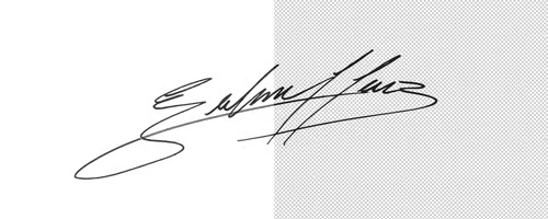
How to Easily Make Your Vector Digital Signature
Tutorialsby Diego Sanchez
In today's digital life, whether you are a freelancer, a business owner, or simply someone who frequently engages in digital transactions, having a well-crafted digital signature is almost indispensable to add a touch of authenticity and credibility to your documents. So today, I will show you how easily you can make your own vector digital signature in Illustrator for you to sign your digital documents or incorporate it into any design work.
Read more
Easily Make an Editable Grunge Text Effect in Photoshop
Tutorialsby Diego Sanchez
There are different ways to make a grunge text effect in Photoshop while keeping your text fully editable, and the most known one is to use a texture as a layer mask to hide part of the text. But Today I will show you a differnt approach on how you can make this kind of effect, while keeping you text fully editable and at the same time give you a bit more control over that effect by using a texture in a new layer (instead of a layer mask) that you can later move, scale, replace or combine with other textures without replacing any kind of layer mask.
Read more