
How to Create a Steampunk Type Treatment in Photoshop

Pipes
First up, lets take a look at the technique used to create the pipes. Using the Rectangle Tool (U) draw your pipe shape, and apply the following gradient overlay layer style. This is the same style I applied to all of the pipes. The only variation is the width and height of the initial shape, and the center color for the gradient. Keep these items varied to create more detail.
 The shine applied to the pipes in the above image, are simple selections that are filled with a white to transparent gradient. Apply this effect to create a shiny copper or brass pipe.
Clamps and Rivets
For the clamps I created a more horizontal rectangle and placed it over a group of pipes as though it's holding them together. I applied the same gradient as the pipes, but just varied the color a bit. For the rivets I used a single pixel pencil brush with spacing set to 400%. Hold the shift key down in order to draw the rivets in a straight line.
 I applied the following layer style to the rivet layers.
 A gradient overlay similar to the pipes. This creates that rounded effect, as if the rivets are wrapping around the pipe.
 This black outer glow creates the shadows for the rivets.
Hoses
For the hoses I created a small rounded rectangle. I applied the following layer styles.
 Light gray gradient with dark gray edges.
 Apply a thin black stroke to create the separation between segments.
Now copy and paste the shape several times and place them on top of each other with a one pixel separation. Once the hose is log enough merge all of the layers.
Apply a thin black stroke to create the separation between segments.
Now copy and paste the shape several times and place them on top of each other with a one pixel separation. Once the hose is log enough merge all of the layers.
 To create the bend in the hose that was needed for the letter P, I used the pupped warp tool. (Edit | Puppet Warp). Place three points by clicking the top, bottom, and middle of the hose.
 You can then drag the points to warp the hose to the correct shape.
 You'll need to rotate top and bottom points by holding the Options key. This will reduce the amount of bend in the center of the hose.
I also used the same puppet warp method for bending the wires and small tubes.
You'll need to rotate top and bottom points by holding the Options key. This will reduce the amount of bend in the center of the hose.
I also used the same puppet warp method for bending the wires and small tubes.
Clocks and Gauges
To start the gauges, I created a circle shape layer, and applied the following layer style.
 This is mostly the same gradient we're using for the pipes but at a 45 degree angle.
Next we need to create a smaller circle placed in the center of the first.
This is mostly the same gradient we're using for the pipes but at a 45 degree angle.
Next we need to create a smaller circle placed in the center of the first.
 Apply a lighter gradient, and set it's angle to 130. Then apply an inner shadow as follows.
 Now we need to find a good clock face. After some searching I found a perfect stock image here. Use a circle selection to remove just the clock face from the stock image. Copy and paste it, then scale it down to fit over our center circle. Now set it's layer style to Multiply.

Gears
For the gears I brought in a little help from Adobe Illustrator. In Illustrator I created a black square. We'll need to create a new pattern brush from this square. To do that, drag and drop the square onto the brushes palette. A pop-up window will appear. Select pattern brush.
 In the brush options window, make sure colorization is set to tints.
 Now create a circle with a black stroke, and apply the new pattern brush.
 Double click the brush in the palette to open the options for the brush. Adjust the scale and spacing as follows.
 Click OK and choose "Apply to Strokes". Now fill the circle with black, and click Object | Expand.
 Now combine the shapes into one using the Pathfinder Palette.
 Now draw a new circle in the center of the first. Give this new circle a white stroke.
 Now apply the same pattern brush.
 Click Object | Expand to expand the shape. And add one more white filled circle to the middle.
To combine the shape into one, and punch out the white areas, we'll need to use the pathfinder palette again. Select the shapes and the Minus Front option.
Click Object | Expand to expand the shape. And add one more white filled circle to the middle.
To combine the shape into one, and punch out the white areas, we'll need to use the pathfinder palette again. Select the shapes and the Minus Front option.
 That completes our work in Illustrator. When you copy and paste the gear over to Photoshop. Select paste as Shape Layer.
 I applied the following layer styles to my gears.


Steam
To create the steam I used the Smoke Brushes Set available here at WeGraphics. I applied it with the color set to white, and erased some of the top portion with a large soft white brush with opacity and flow set to 50%.
Glass Elements
For the transparent glass elements like the dome and the magnifying glass, I simply created my shape, and set the transparency back to 20 or 30%. For the dome I applied a stroke on a separate layer and blurred it using a gaussian blur filter. On a layer behind the glass there is a bit of steam applied from the same smoke brushes mentioned in the previous step.
The magnifying glass uses the same technique, but instead of a stroke there is just a single click with a small soft white brush.
On a layer behind the glass there is a bit of steam applied from the same smoke brushes mentioned in the previous step.
The magnifying glass uses the same technique, but instead of a stroke there is just a single click with a small soft white brush.

Shadows
In order to make the objects appear more 3D, I created shadows around edges where items overlapped. I did this by selecting the shape and using a small soft black brush to paint the shadows on a layer above the selected object.
Placement
To place all of the objects in the letter shapes, I need a reference point. I chose Georgia Bold as my reference font. I placed all of my objects over the letters. Using the letter shapes as boundaries for my objects. I chose certain points and objects to exceed those boundaries where I felt it made sense from a style perspective.

Textures
For the texture that appears over the letters, I chose an image from the Grunge Wall texture pack here at WeGraphics. I scaled the texture down so it just fite over the a letter, then used a soft eraser to remove the portion outside the letter that I didn't want. I then set the grunge layer's Blending Mode to Overlay.
 For the background texture I wanted something that would resemble old cloth or leather. I chose an image from the Subtle Grunge Vol 1 Pack.
 With a soft black brush I painted some shadows on a layer behind all of the letters.

Final Touches
For the final touch, I added a Gradient Map adjustment layer above all layers. This helps to equalize all of the colors a bit. Next, I added a levels adjustment layer to punch up the contrast a bit.
Below is my final image. I hope these techniques will inspire you to create some steampunk imagery of your own. I'd love to see what you come up with. Feel free to share your creations in the comments below.
Next, I added a levels adjustment layer to punch up the contrast a bit.
Below is my final image. I hope these techniques will inspire you to create some steampunk imagery of your own. I'd love to see what you come up with. Feel free to share your creations in the comments below.
More from Tutorials
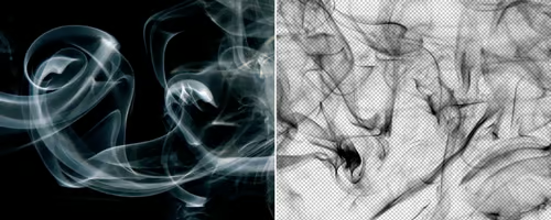
How to Easily Remove Smoke From The Background in Photoshop
Tutorialsby Diego Sanchez
Smoke images can be used in a wide range of applications across various designs, such as adding drama to a photograph, crafting captivating visual effects on posters, or even giving your artwork a mysterious halo. Whichever the case, transparent smoke can serve as a powerful tool in your arsenal. So today, I will show you how easy it is to remove the background from a smoke image, and in the process, prepare the file to change the smoke color at any time you want, allowing you to seamlessly integrate it into your projects.
Read more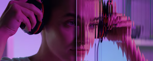
Easily Make a Glass Texture Effect in Photoshop
Tutorialsby Diego Sanchez
The glass effect has been used by many designers and photographers to add depth and dimension to their compositions with a touch of modern elegance. There are, of course, many different ways to apply a glass effect in Photoshop, but today I will show you how easy it is to make your own glass texture and apply realistic distortion to any of your images using nothing but the default Photoshop tools.
Read more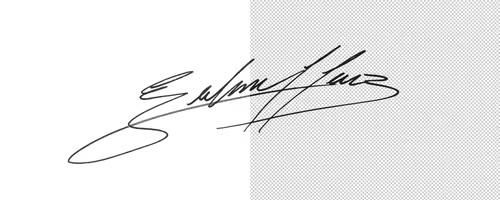
How to Easily Make Your Vector Digital Signature
Tutorialsby Diego Sanchez
In today's digital life, whether you are a freelancer, a business owner, or simply someone who frequently engages in digital transactions, having a well-crafted digital signature is almost indispensable to add a touch of authenticity and credibility to your documents. So today, I will show you how easily you can make your own vector digital signature in Illustrator for you to sign your digital documents or incorporate it into any design work.
Read more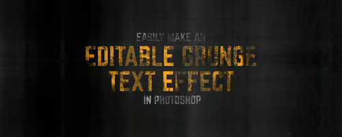
Easily Make an Editable Grunge Text Effect in Photoshop
Tutorialsby Diego Sanchez
There are different ways to make a grunge text effect in Photoshop while keeping your text fully editable, and the most known one is to use a texture as a layer mask to hide part of the text. But Today I will show you a differnt approach on how you can make this kind of effect, while keeping you text fully editable and at the same time give you a bit more control over that effect by using a texture in a new layer (instead of a layer mask) that you can later move, scale, replace or combine with other textures without replacing any kind of layer mask.
Read more