Creating an Expressive Painting Using a Freestyle Method in Photoshop
Preview
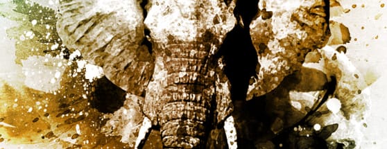
Below is a peek at what we'll be creating in this tutorial. Let's begin! First off, I decide on a subject matter, theme, or general idea. After thinking about it a little, I've decided I want this piece to include elephants and a very stark black and what color palette. Why elephants and why black and white you might ask? There's no particular reason other than elephants have a very interesting look, and I love B&W art. There are no rules to this process so you may have a completely different theme in mind for your piece.
Step 1
I want to start with a nice background texture. Maybe some old paper. I think a stained paper would compliment the piece and give it a little age. After some searching I found a nice texture that isn't too overwhelming in the Subtle Grunge Texture Vol 1 pack here at WeGraphics. I created a new document in Photoshop 1800x2400 pixels at 300dpi, and applied the texture to the background layer.
Step 2
It's now time to search for the main elements of my design, which I've already determined should be elephants. I found some great elephant photos at stock.xchng. I've downloaded the following, elephant 1, elephant 2, and elephant 3. I start by cutting out elephant 1 from the background. My selection process can be quick since I plan for the overall piece to be a rough painting. The edges don't have to be perfectly clean. I used the Quick Selection Tool (w), with a little clean up, to obtain the following selection. I went ahead and cut out the other two elephants using the same process. I plan to keep them on stand by, and use the first elephant as my main focal point for the piece.
Step 3
I add elephant number 1 and size him to fit in the center of the canvas. I then convert the elephant to B&W by selecting Image | Adjust | Desaturate. I'd like to have a little more contrast so I adjust the levels (Image | Adjust | Levels) to the following: 82, 1.00, 182. I went ahead and desaturated the background, as well, to match.

Step 4
Now I'd like to go ahead and start adding some painted elements. This is were the beauty of Photoshop brushes come into play. Instead of creating these elements by hand, I plan to find the right brush sets and add paint with the click of a mouse. After some searching I decide to go with watercolor elements to add the texture I'm after for the piece. I downloaded the Watercolor Vol 1 set and began by adding a few painted background elements. I also want my elephant to appear painted as well to blend with the background a little more. I chose the Dry Brush filter to achieve this (Filter | Artistic | Dry Brush) using the following settings: Brush Size: 6 Brush Detail: 10 Texture: 1
Step 5
Now it's time to bring in our other elephants. I used the same techniques from step 3 to convert the elephants to black and white and blend them to the scene. For the elephant in the top left I set the layer blending mode to Multiply. I wanted that one to stand out less from the background. At this point I went ahead and applied a few more background watercolor elements, and a bit of color burn to the center of the canvas. Here's how mine is beginning to shape up
Step 6
At this point point I'm starting to feel confident about the look. Meaning what I saw in my head is successfully taking shape. I'd like to add a few more painted elements to the piece, but I want the paint to have more of a splattered effect so that it appears the artwork was created in a fit of creative fury (yeah?that sounds cool, huh?). In order to accomplish this, I've downloaded two more brush sets. This time I'm using a set called Ink Squirts and a set called Layered Watercolor Splatters. There is no rhyme or reason to which brushes I choose from each set, and there is no method for where I place them on the canvas or the layer order. It's simply a matter of what looks right to your eye. Your most likely to choose different brushes and place them where you feel is best for your piece. So beyond this point our work will probably differ completely.
Step 7
I like the way the paint is coming together but I feel like a bit of contrast is needed. In order to get that contrast I'm going to apply more splatters, but this time using white instead of black. Pull brushes from each set and begin apply them on layers between the existing layers containing black brushes so that the effect is stacked. Basically you are trying to make it look like white and black paint were used at the same time to paint the piece.
Step 8
Okay, I really like how this is turning out. But overall I feel like it's a little too gray. There's just not enough contrast, in my opinion. I set out to create a black and white piece but now that I'm this far into it, I think it needs a touch of color to help add the contrast that I'm looking for. I'm going to add a gradient fill layer above all other layers in the stack. You do this by clicking the small icon with the half black circle at the bottom of the layers palette, then choose Gradient from the popup menu. For my Gradient I chose an angle of 125 degrees and three colors in order from top left to bottom right: #085c71, #8f5502, #18767c Again, no set rule here, so choose the colors that work best for your piece.
Step 9
Part of this "Freestyle" process of mine is deciding when to quit. When is the piece actually done? Well? That's a hard question to answer. It's done when ever you feel like you've achieved the vision you saw in the beginning, or it's done when you've decided your happy with the outcome. In both instances it's completely up to you. For this piece? It's not quite done, in my opinion. :-) I don't like the texture in the background. I still think it looks a little too muddy. To fix this, I'm going to add a new layer above all others in the stack. I'm going to fill that layer with white, and then apply a Gradient Overlay Layer Style. For the settings I'm going to use: Blend Mode: Overlay Opacity: 100% Two color gradient - Left: #565454 Right: #ffffff Style: Radial Then I'm going to set this layers blend mode to Multiply. Okay, that's it? done!
Conclusion
I hope you learned a little bit about my "Freestyle" process and how I create work from a simple idea to a finished piece using a free flow work method. I hope that this tutorial inspires some new ideas and some creative inspiration. The main lesson I'd like you to take away, is that there is no right or wrong when it comes to this type of design. Experiment to your heart's desire and have fun!More from Tutorials
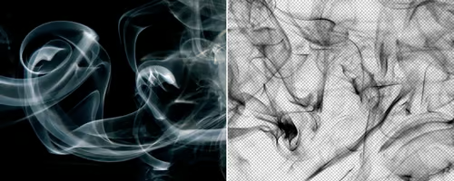
How to Easily Remove Smoke From The Background in Photoshop
Tutorialsby Diego Sanchez
Smoke images can be used in a wide range of applications across various designs, such as adding drama to a photograph, crafting captivating visual effects on posters, or even giving your artwork a mysterious halo. Whichever the case, transparent smoke can serve as a powerful tool in your arsenal. So today, I will show you how easy it is to remove the background from a smoke image, and in the process, prepare the file to change the smoke color at any time you want, allowing you to seamlessly integrate it into your projects.
Read more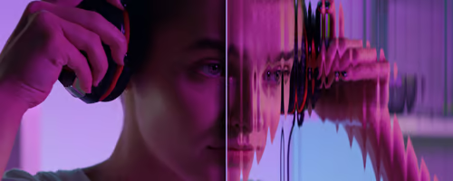
Easily Make a Glass Texture Effect in Photoshop
Tutorialsby Diego Sanchez
The glass effect has been used by many designers and photographers to add depth and dimension to their compositions with a touch of modern elegance. There are, of course, many different ways to apply a glass effect in Photoshop, but today I will show you how easy it is to make your own glass texture and apply realistic distortion to any of your images using nothing but the default Photoshop tools.
Read more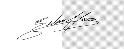
How to Easily Make Your Vector Digital Signature
Tutorialsby Diego Sanchez
In today's digital life, whether you are a freelancer, a business owner, or simply someone who frequently engages in digital transactions, having a well-crafted digital signature is almost indispensable to add a touch of authenticity and credibility to your documents. So today, I will show you how easily you can make your own vector digital signature in Illustrator for you to sign your digital documents or incorporate it into any design work.
Read more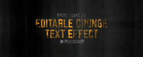
Easily Make an Editable Grunge Text Effect in Photoshop
Tutorialsby Diego Sanchez
There are different ways to make a grunge text effect in Photoshop while keeping your text fully editable, and the most known one is to use a texture as a layer mask to hide part of the text. But Today I will show you a differnt approach on how you can make this kind of effect, while keeping you text fully editable and at the same time give you a bit more control over that effect by using a texture in a new layer (instead of a layer mask) that you can later move, scale, replace or combine with other textures without replacing any kind of layer mask.
Read more