Create a Dramatic Western Style Movie Poster in Photoshop
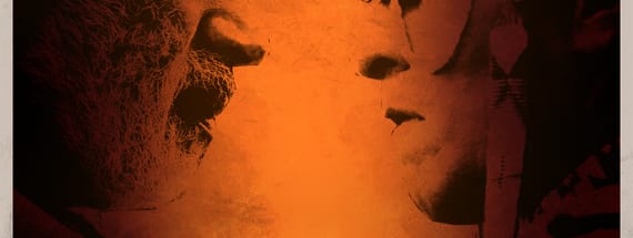
Preview
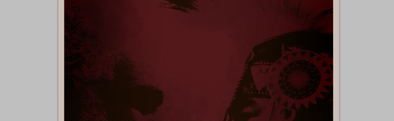
Click on the image for a larger preview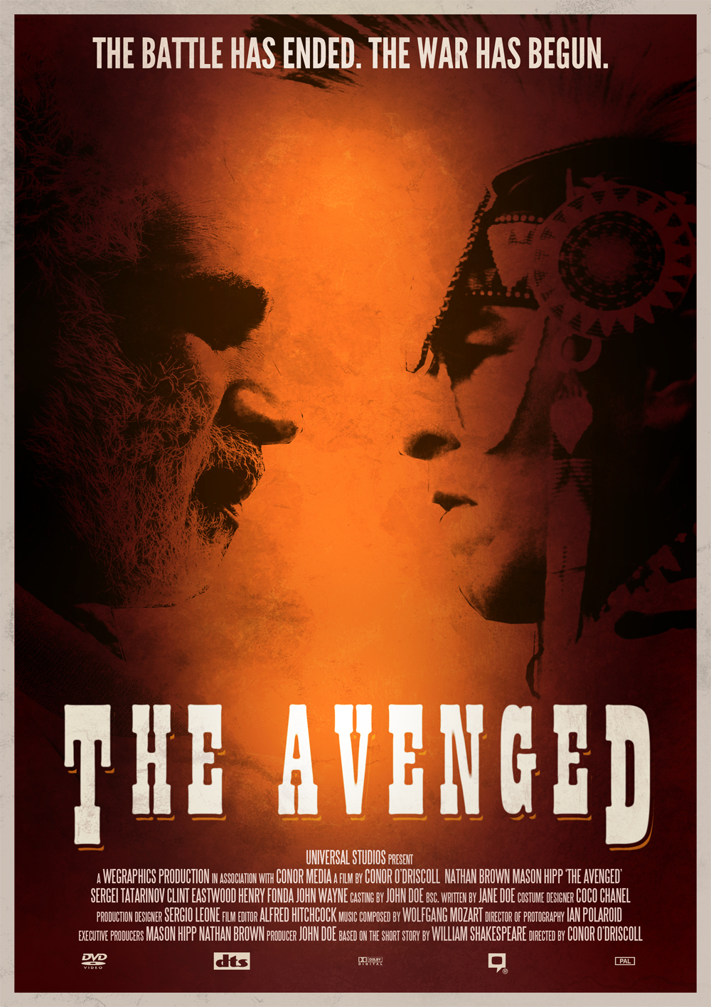
Resources Used:
- Bearded Man Stock Photo
- Native American Stock Photo
- Anderson Thunderbirds Are Go Font
- Steeltongs Font
- League Gothic Font
- WG Grunge Brush Set Vol1
Step 1 - Getting Started
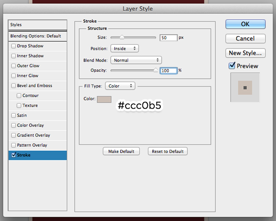
First up, we have to create our canvas - As we?re effectively designing for print, we?ll have to create something pretty large. I?m going to use a preset in Photoshop. In the preset dropdown, select ?International Paper?, and leave the size at A4. This gives us a pretty huge canvas to work with.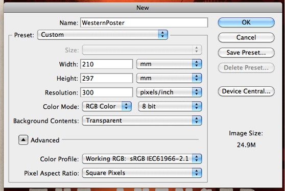 Fill the canvas with #631616. Open up the layer styles for that background layer by double clicking the layer in your Layers panel. Then, add the following layer style to the background, which will give it a nice border:
Step 2 - Bearded Man Graphic
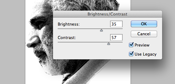
Now it?s time to create the first part of our graphic - the bearded man on the left. Open up our stock photo in a new document, and using whatever method you prefer, select the outline of the man in the photo. I?m a fan of the Polygonal Lasso Tool, but whatever works for you is perfect. Copy that selection, and paste it into a new document (Photoshop should automatically calculate a decent size for your new document).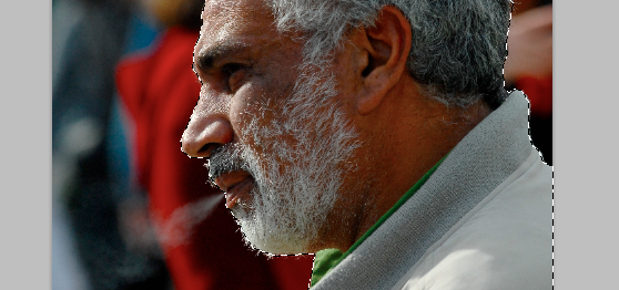 We want to add a few adjustments to make him fit for our design. Go to Image > Adjustments > Black and White, and leave the options as they are to turn your image to grayscale. Then, go to Image > Adjustments > Brightness/Contrast. Set the brightness to 35, and the contrast to 57, and you?ll end up with a much more contrasting, illustration-like graphic.
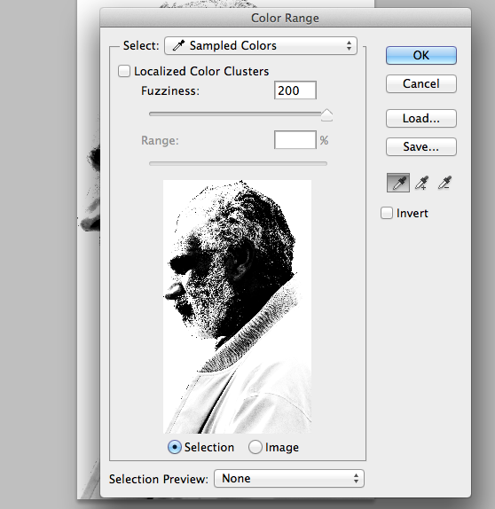
 Now, select the Marquee Tool, and right click anywhere on the canvas. Select ?Color Range?. When the window pops up, select any section of white on the canvas with the eyedropper, and set the Fuzziness to 200. Make sure the Localised Color Clusters are not selected, and hit Okay. You?ll see that all of the white is selected. Delete the selection, leaving you with just the black parts of your image.
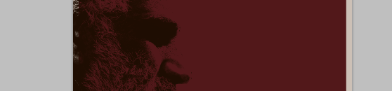
 Copy that image and paste it into our main document. Then go to Edit > Transform > Flip Horizontal, as we want him to be facing to the right. Enable Free Transform (Cmd/Ctrl + T), and rotate our man a little bit anti-clockwise, so he is looking fully forward. Position the layer as shown in the image. In Layer Styles, add a Color Overlay of #1e0d00 to the layer, making it blend in a bit more.
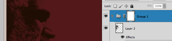
 At the moment, our man is in the document border too, which we don?t want. We could just remove the offending part of the layer, but this will happen with several other elements later on, so we want some way to handle everything in one fell swoop. To do this, place the layer with the bearded man into a new group. With the group selected, press the ?Add Layer Mask? icon at the bottom of the layers panel to add a mask to the group. With the Marquee Tool, select the inner shape (everything but the border). Then, hit Cmd/Ctrl + Shift + I to invert the selection. Hit Shift + Backspace to bring up the Fill window. Set the color to black, hit OK, and your layer mask is created!
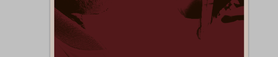
 The final part of this step is to use a soft eraser at 1000px to erase some of the graphic and smooth it out. Specifically, erase most of the torso, and the line defining the forehead. This will make the graphic blend into the background a bit more.
Step 3 - Native American Graphic
Unfortunately, after doing that whole process, you?ve got to do it all over again! The process is the exact same up until the point when you bring the image into your main document, so I?ll let you do the first bit on your own, and come back to me when you?ve brought it into the document. I?ll wait. Done? Great! As before, go to Edit > Transform > Flip Horizontal. Now, you?ll see that this image is not as big as the bearded man. I wouldn?t normally recommend this, but scale up your image in Free Transform. This really shouldn?t work, but as we?re only scaling up a little, and the image is pretty basic, it works a charm.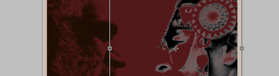 Once again, apply your layer style of #1e0d00, and use an eraser to blend in the torso. If it isn?t already, place this image into our group that has the layer mask.
Step 4 - Brush Effect
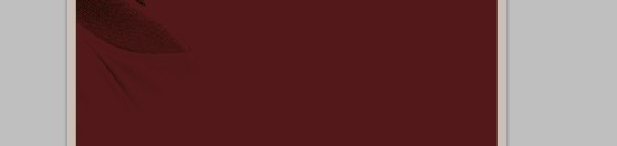
This is an integral part of the design which gives it a bit of much needed depth. To create it is actually very simple. Get a nice grunge brush - I?m using the brush named ?Grunge37? from Sebastiano?s Grunge Brush Set. Then, in the Brush window (F5 to bring it up), add the following settings to the brush: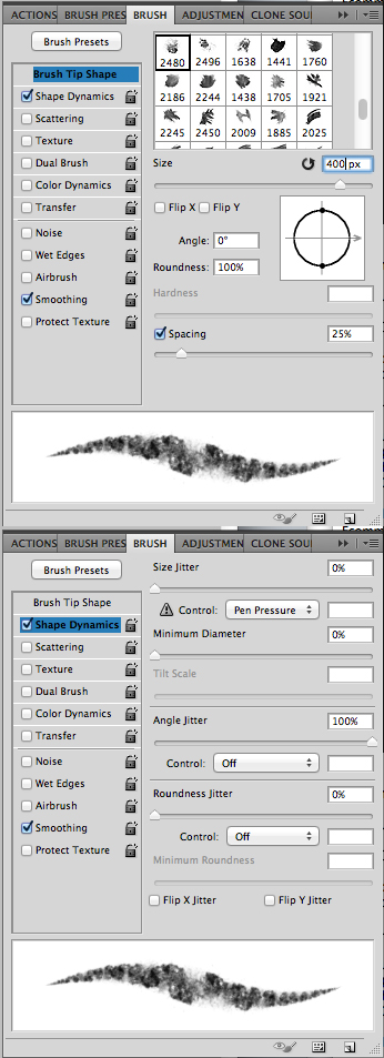 Set the brush color to #120202, and in the toolbar up the top of Photoshop, set the brush blending mode to Multiply, and the opacity to 20%. In a layer below the two photos, start painting behind the two faces. The way this brush will work is a little like watercolor - You start off with a wash, and the more times you paint over it, the darker it gets. I?ve found the effect works best in this design if you make it darker around the edges of the canvas.
Step 5 - Lighting Effects
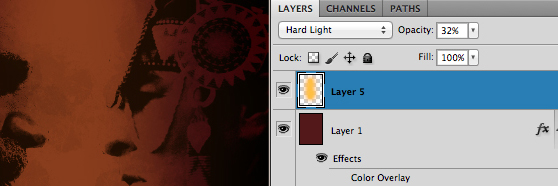
In this step, we?ll be creating a few layers to add some more dramatic lighting. First up is a bit of feathering along the horizontal edges - I feel it isn?t dark enough. To fix this, take a large soft brush (I?m using 1500px) at #000000, and paint around the left and right sides on a new layer above all the rest (but still contained in our group). Then, set that layer?s blending mode to Color Burn, and the opacity to 13%.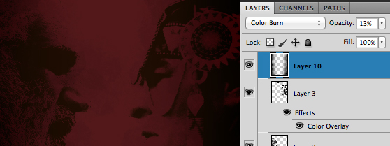 Secondly, we want a lovely orange highlight to bring it to life. For this, we?ll use a large soft brush, once again at 1500px, but this time at #120202. On a new layer below the watercolor effect, paint around the centre. Set the layer?s blending mode to Hard Light, and the opacity fo 32%.
Step 6 - Title
Creating these retro, grungy titles is a pretty easy, if a little long-winded, process. To start off, get your Type tool, and, in the font Anderson Thunderbirds Are Go, type the name of your movie. I?ve made the regular text size 110pt, and the larger letters at each end 140pt. The tracking, which you can set in the Character panel, is at 100. The baseline shift for the larger letters is at -25pt.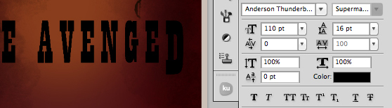 It?s a bit generic at the moment, we want to give it a nice old text effect. To do this, first convert the layer to a smart object, by right-clicking on the layer and clicking ?Convert to Smart Object?. This means we can add a bunch of filters to it and still come back and edit it later. First, we?ll add a Gaussian Blur, by going to Filter > Blur > Gaussian Blur. Set the radius to 3.4px. Then, go to Filter > Sharpen > Smart Sharpen, and set the amount to 500% and the radius to 11px. This will give it some rounded edges, and somewhat of a vintage effect. Don?t worry if the sharpening gave your text some crazy colors, we?ll be changing that later.
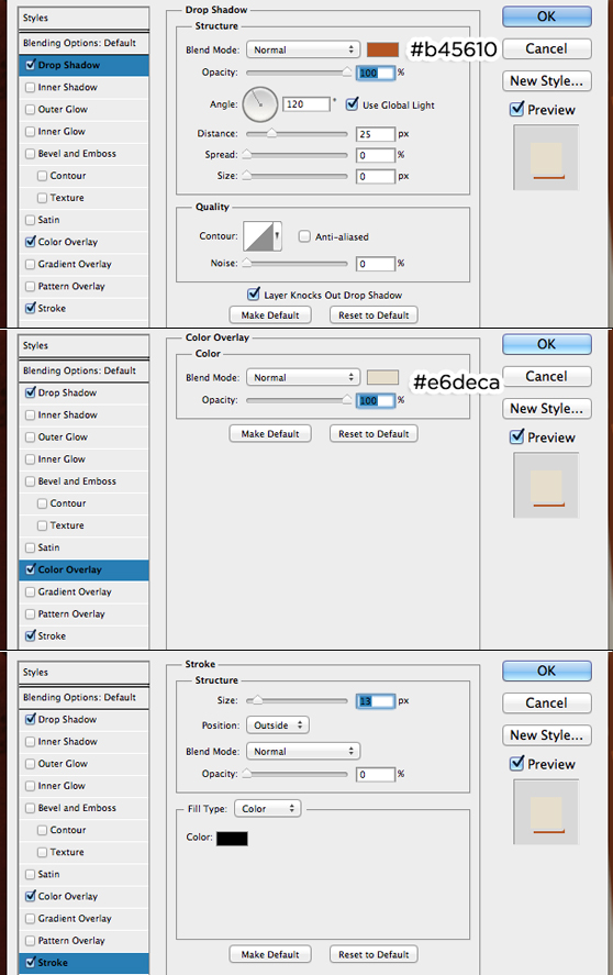
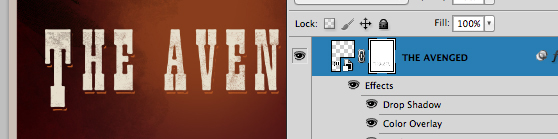
 Now we want to add some nice effects to give our title a little something. Add the following styles to the layer:
 This is all looking really great, but I feel we can go a bit more grungy. To do this, add a layer mask to our layer, and using a grunge brush at #000000, paint over the text a little to spice it up a little.
Step 7 - Credits
For the credits, we?ll be using the Steeltongs font. The font has lots of options to make great credits, but for the one we?ll be creating, we?ll use a very simple method. Set the text to Small Caps, in the Character panel, and type out your credits. For the person?s role, type in lower case, and for the name itself, type in caps. I?ve set the size to 15pt, with 16pt leading, and in #ddc8be. You?ll also want to center-align the text.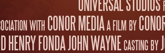
Step 8 - Movie Logos
Once again, we?ll be using the Steeltongs font, as it has a bunch of useful logos built in (To type them, check out the instructions that come with the font). Set your font size to 18pt, the color to #ddc8be, and the tracking to a colossal 4,900.
Step 9 - Tag Line
This one is a pretty straightforward one - Type out your clichéd, cheesy tag line in League Gothic, at 35px in #eadbc9. Set the type to All Caps too - Couldn?t be easier!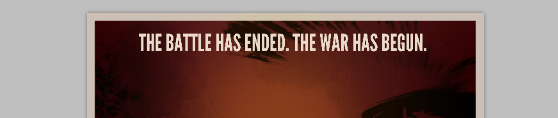
Step 10 - Grunging it up
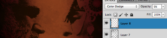
The design is looking great, but I can?t resist putting some subtle grunge effects in there. To do this, we will once again use a bunch of brushes from the Grunge Brush set. In our first layer, on top of everything else (and not in our masked group), use #24110d to paint all around the canvas. Then, set that layer?s blending mode to Color Burn and the opacity to 19%.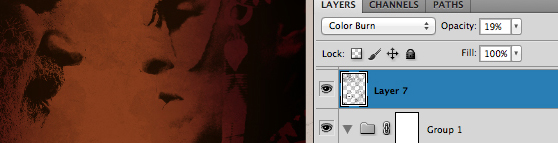 On another layer above that, paint around in #e1d0cc, and set the blending mode to Color Dodge and the opacity to 5%.
Step 11 - Finishing Touches
We?re painfully close to finishing, but I still feel the design is a little dark. To fix this, get a large soft brush (I?m using 1500px) at #ffffff, and paint a vertical strip around the middle of the canvas. Set that layer?s blending mode to Overlay, and you?re done!
Final Result
Conclusion
It is much easier than you might think to create a really effective movie poster - It just takes a bit of time, and the ability to take it step by step. Why not try make one yourself - It really is a bunch of fun!More from Tutorials
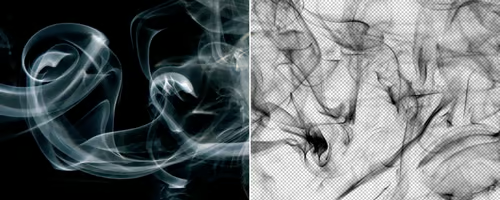
How to Easily Remove Smoke From The Background in Photoshop
Tutorialsby Diego Sanchez
Smoke images can be used in a wide range of applications across various designs, such as adding drama to a photograph, crafting captivating visual effects on posters, or even giving your artwork a mysterious halo. Whichever the case, transparent smoke can serve as a powerful tool in your arsenal. So today, I will show you how easy it is to remove the background from a smoke image, and in the process, prepare the file to change the smoke color at any time you want, allowing you to seamlessly integrate it into your projects.
Read more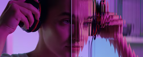
Easily Make a Glass Texture Effect in Photoshop
Tutorialsby Diego Sanchez
The glass effect has been used by many designers and photographers to add depth and dimension to their compositions with a touch of modern elegance. There are, of course, many different ways to apply a glass effect in Photoshop, but today I will show you how easy it is to make your own glass texture and apply realistic distortion to any of your images using nothing but the default Photoshop tools.
Read more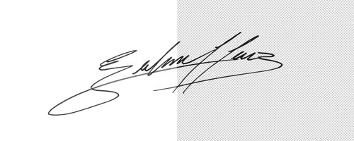
How to Easily Make Your Vector Digital Signature
Tutorialsby Diego Sanchez
In today's digital life, whether you are a freelancer, a business owner, or simply someone who frequently engages in digital transactions, having a well-crafted digital signature is almost indispensable to add a touch of authenticity and credibility to your documents. So today, I will show you how easily you can make your own vector digital signature in Illustrator for you to sign your digital documents or incorporate it into any design work.
Read more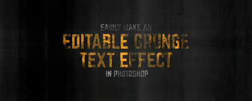
Easily Make an Editable Grunge Text Effect in Photoshop
Tutorialsby Diego Sanchez
There are different ways to make a grunge text effect in Photoshop while keeping your text fully editable, and the most known one is to use a texture as a layer mask to hide part of the text. But Today I will show you a differnt approach on how you can make this kind of effect, while keeping you text fully editable and at the same time give you a bit more control over that effect by using a texture in a new layer (instead of a layer mask) that you can later move, scale, replace or combine with other textures without replacing any kind of layer mask.
Read more