Mobile Web Mastery: 25 Tips on Designing for Mobile Devices
I recently read that it's expected that by 2013 there will be more users viewing the Internet through a mobile device versus a desktop or laptop computer. That's pretty amazing, and it means that more so now than ever before, we as designers, should consider designing and developing for mobile users. It's become a necessity that will continue to grow. So lets take a look at some tips on designing for mobile devices.


 Most mobile devices do not support, Flash, Java Applets, frames and pop ups. Avoid these technologies when developing your mobile site. If you're married to Flash now may be the time to cut the cord. With Adobe's recent announcement that it has ceased the development ofFlash Player for browsers on mobile devices.
 The iPhone has a significantly large portion of the market share when it comes to mobile devices.
When building sites specfically For iPhone you?ll need to target their screen size. The screen size is set to 320px by 480px for older iPhones and 640px by 960px for iPhone 4 and iPhone 4S.
Using CSS3 media queries you can add styles to your site?s main stylesheet that will only effect iPhone.


 Free iPhone App Icon Kit
 Dark Mobile User Interface Kit
 Fresh iPhone UI Kit
 Glossy 3D UI Kit
 RhoMobile
The tagline ?one codebase, every smartphone? pretty much says it all.


Website or App?
That is the question. An app has its advantages mainly in user experience, potential off-line usage, and customer retention. But considering more in-depth design and development for apps across mobile platforms, we'll focus this article on mobile websites. Mobile websites are most likely what you'll be developing for your client base, unless they have customers highly invested in their brand that would likely justify downloading and installing an app. Mobile websites are easier and faster to develop and deploy. They are also accessible by any device with web browsing capability.Designing for a Smaller Screen Size
When designing for mobile device screens, you must take into considerations the smaller size of the screen. This will be difficult for those among us who are used to designing for large HD monitors with capability to display graphics at 1920X1200 or higher. Today's iPhone 4 has a resolution of 640 x 960, with the iPad a bit higher at 1024 x 768. But those resolutions are high in comparison to other devices. Some of the Android and Blackberry phones feature a screen size at 320x240. That's considerably smaller than what we're used to designing for, but it's crucial to keep in mind as you set out to design your mobile website.
Consider Poor Connectivity
Remember a few years back before broadband internet was available in every corner coffee shop, and web designers had to consider the users connection a little closer when optimizing images and video for faster load time. You'll need to do the same when designing for your mobile site. Service providers are rolling out faster speeds all the time, but coverage still remains spotty at best in some areas. Plus some users, who do not have unlimited data plans, pay for data downloads. So as developers we must think back to those early modem days. You'll need reduce code, and remove unnecessary tags and comments. Keep images small, and compressed for lighter download times.Choose a Separate URL for Your Mobile Site
If you're building a completely separate site for mobile devices, consider choosing a URL for the new site. For example, http://www.yoursite.com/mobile or if you can add custom sub domains to your exiting domain try something like http://mobile.yoursite.com. Keeping a simple structure like the above for your URL helps make the user experience easier to follow and remember.
Detect And Redirect Users
Detecting if a user is mobile or not and sending them to the correct site is important to keep the experience seamless. One good way to detect a device is to make use of the WURFL database. WURFL is a database available on the web that collects information about all the mobile devices out there. The WURFL project has APIs for several programming languages. Yelitza Jaramillo has written a great article on using the PHP API Package for WURFL. If you have your own method for device detection, please feel free to share in the comments below.Consider a Mobile Friendly 1 Column Page Structure
When a page loads on a phone it is typically zoomed all the way out so that it all fits onto the screen. The screens on most all phones are so small that the page can not be read until it is zoomed in. This isn't ideal because it creates more steps for the user while reading your content. Typically they will have to scroll both vertical and horizontal while reading. Instead try implementing a one column layout that fits within a mobile screen. The user will still likely have to scroll, but it will only be vertical.
Simplify and Optimize Your Content
Again, think light and simple. Keep a less is more mentality when organizing your content and page structure. Consider removing extra links and content that are not within the main content area. Items typically found in the sidebar or footer of traditional sites can often be removed so that the focus is streamlined and simplified. By removing this type of content you are also reducing the page size and load time, which is an important aspect of mobile page design.
Reduce Your Navigation and User Input
User input can be difficult on some phones. It's not as fast as a traditional keyboard, and users are more likely to make mistakes. Given that, we can make a few adjustments to reduce the amount of input needed from the user. For example, information can be pulled from a user's existing account during a checkout process. Navigation can be reduced to a drop down menu. We can also take advantage of a phone's built in functionality, see more below on this.
Avoid Absolute Sizes
When designing for smaller screens avoid defining dimensions in absolute pixels. For example if you define a width of 200px, that may be the majority of the screen on some phones. Try using relative sizes like ems and percentages, so that the size will auto-adjust.Avoid Scrolling... Really?
In my opinion you simply can't avoid all scrolling in most instances, given the smaller screen size of mobile devices, but you can make some adjustments to reduce the scrolling. Creating a 1 column layout as mentioned above to keep scrolling vertical is ideal. Reducing the amount of images and extra content on the page is another good suggestion. Also consider extra content in the header, such as logos and navigation, these can push content further down the page causing unnecessary scroll.Designing for Touch Screen
Touch screens on smartphone help improve the user experience, except when it comes tapping very small buttons and text links. Fingers are typically too wide to accurately tap a small text link. For important links and navigation consider using large buttons that span the width of the screen.
Choosing the Right Font for Your Content
With the ability to embed fonts into our webpages, it is essential to choose a font that is readable on a small screen. Avoid script and handwritten fonts, even for titles or text that is intended to be larger. Even larger text appears small on a phone. Also consider the appropriate amount of letter spacing and line spacing to keep your content as readable as possible.Flash, Java, Frames and Pop Ups are Out the Window
 Most mobile devices do not support, Flash, Java Applets, frames and pop ups. Avoid these technologies when developing your mobile site. If you're married to Flash now may be the time to cut the cord. With Adobe's recent announcement that it has ceased the development ofFlash Player for browsers on mobile devices.
More than 1 Mobile Site?
With the ability to detect device types it raises the question on whether or not to develop more than one mobile site. For example you may want to create a site for more modern smartphone such as the iPhone and Android, and an even more reduced site for older, less capable phones. By doing so you've created an experience tailored to the users device.Use the Phones Built in Functionality to Your Advantage
This is where you can take advantage of viewing your site from a mobile phone. Phones can do things that PCs can't, so use them whenever possible to improve your user's experience. For example: - Make phone numbers clickable to place a call. - Give the user the ability to find you on a map, or find the nearest place to locate your product, etc... - Use special features such as QR or bar code scanning.A Look at Mobile CSS
Below are some general tips for CSS considerations when designing for mobile. - Set your wrapper widths to percentages versus fixed widths so that your page will wrap to various screen sizes. - Set paragraphs, headings and navigation to display block to fill the screen. - Mobile Safari doesn't fully support @font-face. - Take a look at CSS3 Media Queries for creating a mobile version of your site. - Remember to keep things simple and streamlined.Designing for iPhone
 The iPhone has a significantly large portion of the market share when it comes to mobile devices.
When building sites specfically For iPhone you?ll need to target their screen size. The screen size is set to 320px by 480px for older iPhones and 640px by 960px for iPhone 4 and iPhone 4S.
Using CSS3 media queries you can add styles to your site?s main stylesheet that will only effect iPhone.
Consider the Device Orientation
With iPhones and other modern smart phones you can change the screen orientation from portrait to landscape by tilting the phone on its side. This is one more reason to keep your site layout fluid so that it will fill the space no mater what the screens orientation is.
Mobile jQuery
If you're a front end developer than you're already familiar with the power of jQuery, and it's write less do more mentality. The same goes for the new jQuery Mobile. A unified, HTML5-based user interface system for all popular mobile device platforms, built on the rock-solid jQuery and jQuery UI foundation. Its lightweight code is built with progressive enhancement, and has a flexible, easily themeable design. This framework is worth a serious look if your planning to develop a robust user experience within your mobile site.
Mobile UI Kits and Icons
If your brain leans a little more to the development side of things versus the world of design, fear not. There are plenty of stock UI kits available for mobile web. Free iPhone App Icon Kit
 Dark Mobile User Interface Kit
 Fresh iPhone UI Kit
 Glossy 3D UI Kit
Tools for Mobile Development
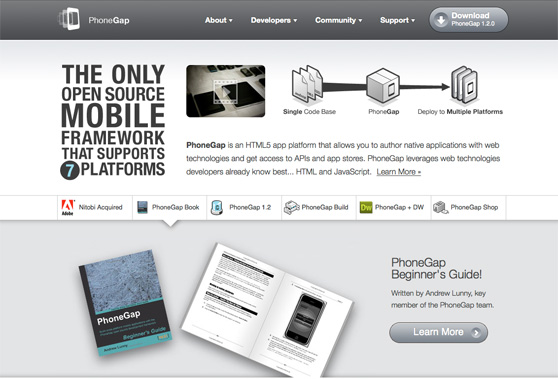
PhoneGap Their platform lets you easily construct HTML5-based apps as native applications on 6 different platforms. RhoMobile
The tagline ?one codebase, every smartphone? pretty much says it all.

WordPress Mobile Edition for WP Users
If you're a fan of Wordpress there are several mobile friendly plugins available. One in particular stands out. WordPress Mobile Edition is a plugin that shows an interface designed for a mobile device when visitors come to your site on a mobile device. Mobile browsers are automatically detected, the list of mobile browsers can be customized on the settings page.How to Test Your Mobile Website
Testing on mobile devices can be a huge task. Especially since it is unlikely that you own dozens of different mobile phones to test with. Enter Opera Mobile Emulator. The Emulator supports around 20 different platforms.
Incredible Examples of Mobile Websites
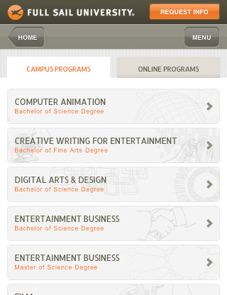
Looking for inspiration? Look no further. Below are some awesome examples of mobile websites.


