Illustrator Quick Tip: Embellish a Script Font Using the Trim Pathfinder
This simple technique is so fast and easy, you're gonna love it. To transform a script font into something that looks like custom hand lettering can be a useful skill to have in your design arsenal. Let's dive right in and see how it's done.
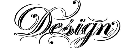
First up, here's a look at what we'll be creating.

Step 1
Start with a good script font. I used Edwardian Script but any free script font will work as well, like English or Old Script. Once you've chose a script font, type out a word on a blank artboard in Illustrator.

With the word selected, click (Type | Create Outlines) then (Object | Ungroup). Now you should be able to select each letter individually as a shape.

Step 2
Take the first letter and move it away from the rest. With the letter selected, hold down the option key (or Alt key) and drag the letter to the left a few pixels. This will create a duplicate of the letter shape.

Now with both shapes selected, press the Trim button on the Pathfinder panel.

Click (Object | Ungroup) or (Cmd+Shift+G) again to separate the shapes. Now you can select the pieces and move them around to create a more ornate letter shape.

Step 3
Now repeat the previous steps for all of the letters, and place them back in order.

Now take some of the bits and pieces of these letters and place them around the word to further embellish the letter forms.

That's it... a custom hand lettered look in minutes!
More from Tutorials
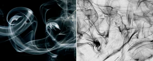
How to Easily Remove Smoke From The Background in Photoshop
Tutorialsby Diego Sanchez
Smoke images can be used in a wide range of applications across various designs, such as adding drama to a photograph, crafting captivating visual effects on posters, or even giving your artwork a mysterious halo. Whichever the case, transparent smoke can serve as a powerful tool in your arsenal. So today, I will show you how easy it is to remove the background from a smoke image, and in the process, prepare the file to change the smoke color at any time you want, allowing you to seamlessly integrate it into your projects.
Read more
Easily Make a Glass Texture Effect in Photoshop
Tutorialsby Diego Sanchez
The glass effect has been used by many designers and photographers to add depth and dimension to their compositions with a touch of modern elegance. There are, of course, many different ways to apply a glass effect in Photoshop, but today I will show you how easy it is to make your own glass texture and apply realistic distortion to any of your images using nothing but the default Photoshop tools.
Read more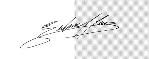
How to Easily Make Your Vector Digital Signature
Tutorialsby Diego Sanchez
In today's digital life, whether you are a freelancer, a business owner, or simply someone who frequently engages in digital transactions, having a well-crafted digital signature is almost indispensable to add a touch of authenticity and credibility to your documents. So today, I will show you how easily you can make your own vector digital signature in Illustrator for you to sign your digital documents or incorporate it into any design work.
Read more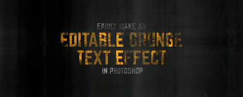
Easily Make an Editable Grunge Text Effect in Photoshop
Tutorialsby Diego Sanchez
There are different ways to make a grunge text effect in Photoshop while keeping your text fully editable, and the most known one is to use a texture as a layer mask to hide part of the text. But Today I will show you a differnt approach on how you can make this kind of effect, while keeping you text fully editable and at the same time give you a bit more control over that effect by using a texture in a new layer (instead of a layer mask) that you can later move, scale, replace or combine with other textures without replacing any kind of layer mask.
Read more