Creating an Embedded Concrete Effect Using Layer Styles Only
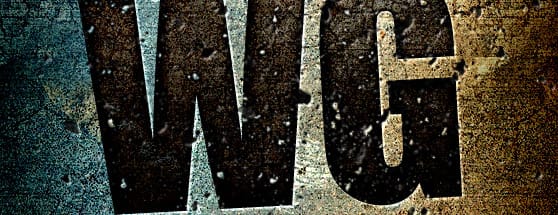
First up, you'll need this texture pattern to follow along with the tutorial. Download it here. Double+click the .pat file to install it. Here's a look at what we'll be creating.
Step 1 - Creating the Background
Create a new document. Mine is 558x600 72 dpi. On a new layer, fill with any color you choose. Then double+click the layer to open the layer styles window. Apply the following settings.

 For the pattern, choose the grunge pattern from the download.
 You should end up with something like this. Not bad for just a few layer styles, right?

Step 2 - Adding and styling the text.
Next, we need to add some text. Any text will do. In my example I used Impact for the font. I also tilted it a little bit to the left. Once you've entered your text, apply the following layer styles.


 Your text should now look similar to mine.

Step 3 - Final Touches
For some final adjustments, I rasterized the text. Then I used a brush from the Free Dust Particles Brush Set as an eraser to remove some portions of the text. Last, I used another brush from the set, and applied a single click on a new layer above all others. Then I copied the layer styles applied to the text by Ctrl+Clicking the layer and selecting "Copy Layer Style", then Ctrl+Clicking the brush layer and selecting "Paste Layer Style". I wanted to give the particles the same inset look of the text.
 I hope this quick and simple tutorial has given you a bit of inspiration to experiment with layer styles to see what kind of effects you can create!
More from Tutorials
How to Easily Remove Smoke From The Background in Photoshop
Tutorialsby Diego Sanchez
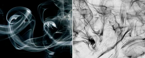
Smoke images can be used in a wide range of applications across various designs, such as adding drama to a photograph, crafting captivating visual effects on posters, or even giving your artwork a mysterious halo. Whichever the case, transparent smoke can serve as a powerful tool in your arsenal. So today, I will show you how easy it is to remove the background from a smoke image, and in the process, prepare the file to change the smoke color at any time you want, allowing you to seamlessly integrate it into your projects.
Read more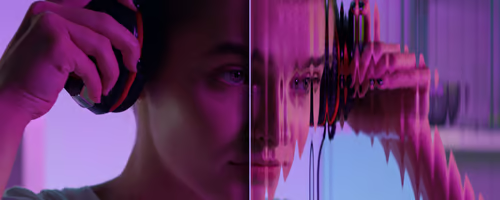
Easily Make a Glass Texture Effect in Photoshop
Tutorialsby Diego Sanchez
The glass effect has been used by many designers and photographers to add depth and dimension to their compositions with a touch of modern elegance. There are, of course, many different ways to apply a glass effect in Photoshop, but today I will show you how easy it is to make your own glass texture and apply realistic distortion to any of your images using nothing but the default Photoshop tools.
Read more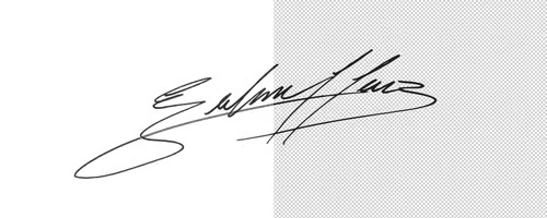
How to Easily Make Your Vector Digital Signature
Tutorialsby Diego Sanchez
In today's digital life, whether you are a freelancer, a business owner, or simply someone who frequently engages in digital transactions, having a well-crafted digital signature is almost indispensable to add a touch of authenticity and credibility to your documents. So today, I will show you how easily you can make your own vector digital signature in Illustrator for you to sign your digital documents or incorporate it into any design work.
Read more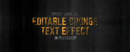
Easily Make an Editable Grunge Text Effect in Photoshop
Tutorialsby Diego Sanchez
There are different ways to make a grunge text effect in Photoshop while keeping your text fully editable, and the most known one is to use a texture as a layer mask to hide part of the text. But Today I will show you a differnt approach on how you can make this kind of effect, while keeping you text fully editable and at the same time give you a bit more control over that effect by using a texture in a new layer (instead of a layer mask) that you can later move, scale, replace or combine with other textures without replacing any kind of layer mask.
Read more