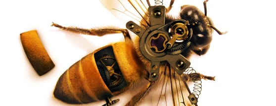
Creating a Highly Detailed Steampunk Insect
 Typically with projects like these I will gather a group of photos that I think might work in the composition, and as I work I begin to narrow down what photos will and will not work. My final list of photos consisted of these:
- Honey Bee Macro (incredible photo!)
- Spring/Coil Image
- Clock Mechanism
- Skeleton Caseback
Typically with projects like these I will gather a group of photos that I think might work in the composition, and as I work I begin to narrow down what photos will and will not work. My final list of photos consisted of these:
- Honey Bee Macro (incredible photo!)
- Spring/Coil Image
- Clock Mechanism
- Skeleton Caseback
Step 1 - Deciding What Clock Gears to Use
I think the hardest part of building a composition like this is deciding what pieces to extract and composite into the the piece. In this image it was a matter of what gears and pieces would work on the bee's body, and which of those pieces would fit well together and look like something someone would actually build. On the two clock gear images I used the following pieces.
 I used the Quick Mask Mode (Q) to extract these pieces, but you can use whatever selection method that you prefer.
Step 2 - Adding the Extracted Images to the Main Composition
This is where the blending and color matching comes into play. The idea is to make these pieces look as natural as possible in the composition, so that your eye does not get automatically drawn to an area that looks distracting or unnatural. To start, I created a new document 1500x1500 at 72 dpi, and pasted the bee image onto it. I added the first piece, and positioned it in a way that I felt it looked natural. I decided this seemed like a starting point that I could build onto with other mechanical parts.
 From there I began adding other pieces, and positioned them like puzzle pieces. "This fits here. That fits there... etc". As I was positioning the mechanical parts I realized that the arms sticking out sort of aligned with the bee's wings, so I knew I wanted to accent that a little more. In comes the coil springs. I used the Puppet Warp Tool to bend the springs in the direction I wanted. If you've never used the Puppet Warp Tool
 I felt like the metal on the arms was a little too clean compared to the first piece. So decided to overlay a texture just on that layer. Any good metal grunge texture will work well.
 Next up, I painted some subtle shadows using a soft black brush at 30% opacity. The idea is to start light and build up the shadows.


Step 3 - More Detail
I like how this is looking so far. But I feel like something more is needed. Looking at the clock gear images, I decided it might be cool if there was a little hatch or opening in the bee where the viewer could get a glimpse at some of the inner mechanisms of the bee. In order to do that I made a vector shape in the spot I felt the hatch should appear.
 I made a selection using this shape and copied and pasted the bee's back to make a separate hatch piece laying off to the side. I used the distort transform tool (Edit | Transform | Distort) to warp the hatch slightly so that the angle looked natural. Then I painted some shadows on a layer underneath.
 As for the exposed mechanisms inside the view port, I coped and pasted another section of the clock gears, and used the vector shape as a guide to remove the portions I didn't want.
 Now it's just a matter of shading the area to look a bit more natural. I used the soft black brush at 30% again.

Step 4 - Final Tweak
Before calling it complete, I noticed that one of the gear images has a small dial. So I decide that I have to use it somewhere. After a bit of trial and error, I decide to simply place on the side of the bee next to the exposed hatch.
Step 5 - Adjusting the Final Lighting
To blend the colors and light a little better, I added a Gradient Map adjustment layer. I set the layer's blend mode to opacity, and used the following gradient. Below is the final piece.
I hope this overview has given you an idea of my thought process as I worked through this piece, and some of the ideas that I applied while designing. Gather some photos up and give it a try. Steampunk styled compositions can be incredibly detailed and a lot of fun to build.
Below is the final piece.
I hope this overview has given you an idea of my thought process as I worked through this piece, and some of the ideas that I applied while designing. Gather some photos up and give it a try. Steampunk styled compositions can be incredibly detailed and a lot of fun to build.
More from Tutorials
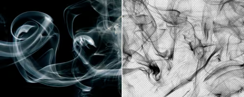
How to Easily Remove Smoke From The Background in Photoshop
Tutorialsby Diego Sanchez
Smoke images can be used in a wide range of applications across various designs, such as adding drama to a photograph, crafting captivating visual effects on posters, or even giving your artwork a mysterious halo. Whichever the case, transparent smoke can serve as a powerful tool in your arsenal. So today, I will show you how easy it is to remove the background from a smoke image, and in the process, prepare the file to change the smoke color at any time you want, allowing you to seamlessly integrate it into your projects.
Read more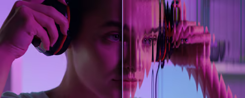
Easily Make a Glass Texture Effect in Photoshop
Tutorialsby Diego Sanchez
The glass effect has been used by many designers and photographers to add depth and dimension to their compositions with a touch of modern elegance. There are, of course, many different ways to apply a glass effect in Photoshop, but today I will show you how easy it is to make your own glass texture and apply realistic distortion to any of your images using nothing but the default Photoshop tools.
Read more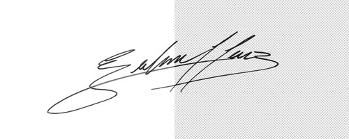
How to Easily Make Your Vector Digital Signature
Tutorialsby Diego Sanchez
In today's digital life, whether you are a freelancer, a business owner, or simply someone who frequently engages in digital transactions, having a well-crafted digital signature is almost indispensable to add a touch of authenticity and credibility to your documents. So today, I will show you how easily you can make your own vector digital signature in Illustrator for you to sign your digital documents or incorporate it into any design work.
Read more
Easily Make an Editable Grunge Text Effect in Photoshop
Tutorialsby Diego Sanchez
There are different ways to make a grunge text effect in Photoshop while keeping your text fully editable, and the most known one is to use a texture as a layer mask to hide part of the text. But Today I will show you a differnt approach on how you can make this kind of effect, while keeping you text fully editable and at the same time give you a bit more control over that effect by using a texture in a new layer (instead of a layer mask) that you can later move, scale, replace or combine with other textures without replacing any kind of layer mask.
Read more