30 Examples of How to Bring Typography to the Next Level
Typography is an important and complex graphic design field. There are designers who make of type embellishment the main key of their works. In my opinion the ability to properly use typography is what make the difference between a good and a great designer. Today I selected for you 30 inspirational examples of how unique type treatments can enhance your works.


Experimental Prints
by Colorcubic
Destructive Vintage Typo
by Alberto Seveso
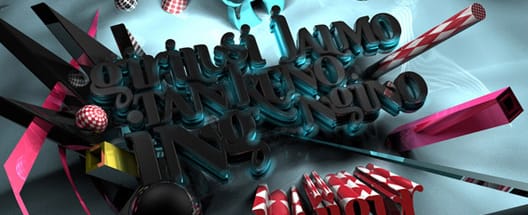
Fresh
by Draniu
1001 Words Poster
by Fredrik Oscarsson
Future Type Treatment
by Luke Lucas
Genr birthday
by Frelon
Halifax
by Shinybinary
BFA Thesis Exhibition Poster
by David Waters
Nature Never Go's Out of Style
by Niklas Lundberg
Helvetica
by Kim Høltermand
Illustrated Type
by Sumeco
kdu poster
by Into
Good Life Micro Festival logo
by Michele Angelo
new work
by Serial Cut
OWL CITY
by Barton Damer
Pink Party Poster
by Steve Goodin
Rebuild
by Gomedia
SAKIDEAMSCHENI
by Giga Kobidze
Epoc Live
by Mateusz Sypien
Requiem
by Solvstrom
Summer 09 posters
by James White
Swing City
by Luke Lucas
Tasty Type
by Magomed Dovjenko
elektrotrash
by Alex Varanese
Tyler Durden
by Tato Toledo
Type Treat
by Alex Beltechi
Typographic experiment
by mattias svanström
Waste Not, Want Not
by Mike Campau
WOLFMOTHER Tour Poster
by Barton Damer
Xperiment Typography
by Eno FreshForDeath & indranesiaMore from Inspiration
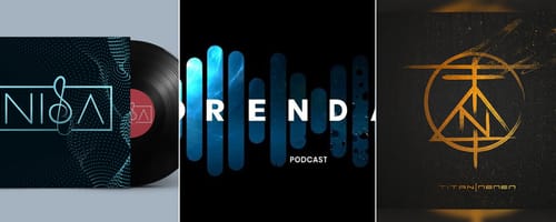
The Best Music Logos of the Year
Inspirationby Bridgette Mabuto
Our best music logos and design inspirations will spark your creativity for your next music-themed project.
Read more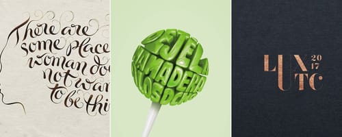
5 Big Rules of Typography, and Examples of Designers Breaking Them
Inspirationby Bridgette Mabuto
These five typography rules provide guidelines to make using different fonts easier and more effective, resulting in powerful, beautiful designs.
Read more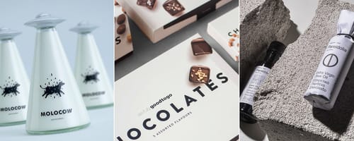
Product Packaging — Gorgeous Inspiration, and Mockups to Match
Inspirationby Bridgette Mabuto
Product packaging draws attention and sells by creatively and uniquely setting that product or brand apart.
Read more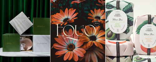
Fancy Fonts that People Love
Inspirationby Bridgette Mabuto
Fancy fonts are the perfect way of making a big impression and grabbing an audiences attention.
Read more